Bridesmaid Color Palette Ideas for an Elegant Wedding
Choosing a bridesmaid color palette sounds simple until the details begin to stack up. A shade that feels romantic in a mood board can look entirely different beside venue lighting, florals, table linens, and a row of dress silhouettes. Add seasonality, skin tones, wearability, and the reality that bridesmaids rarely share the same coloring or comfort preferences, and the decision quickly becomes more complex than picking a favorite hue.
The challenge is not only finding beautiful bridesmaid dresses. It is creating a palette that feels cohesive in photographs, flattering in person, aligned with the wedding color palette, and practical for a long celebration that may move from ceremony to cocktail hour to candlelit reception. The most successful choices usually come from structure rather than impulse. A clear palette makes every other styling decision easier.
This guide approaches the process the way an experienced wedding stylist would: beginning with color families and harmony, then translating those ideas into real wedding settings, seasonal direction, mix-and-match solutions, and practical tools such as swatches and mood boards. Whether your celebration leans coastal, garden-inspired, rustic, or ballroom formal, the goal is the same: a bridesmaid lineup that looks intentional, elegant, and easy to wear.
Why choosing a bridesmaid palette feels harder than it should
Bridesmaid styling sits at the intersection of fashion and event design. The dresses must work as clothing on individual people, but they also function as part of the visual architecture of the wedding. That is why a color that seems perfect on a hanger may compete with florals, flatten under bright summer sun, or feel too heavy for an airy spring ceremony.
There are also practical constraints that make the decision more nuanced. Seasonality matters because soft pastels, rich jewel tones, greens, and neutrals all read differently depending on weather and natural surroundings. Comfort matters because a palette often needs to work across different silhouettes and fabrics. Wearability matters because many bridal parties want a dress color that feels polished in photographs but still believable for re-wear. Even shopping logistics play a role, especially when bridesmaids are ordering from brand collections such as Azazie, Kennedy Blue, or Ever-Pretty, where swatches, shade names, and style availability shape what is realistic.
Understanding this tension helps solve it. The palette is not just a decorative preference. It is a planning tool that connects dresses, decor, florals, and atmosphere into one visual story.
The styling principles that make a palette work
Start with color families, not isolated shades
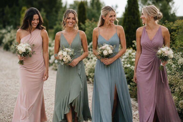
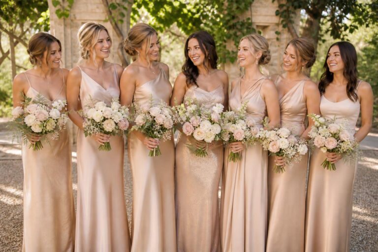
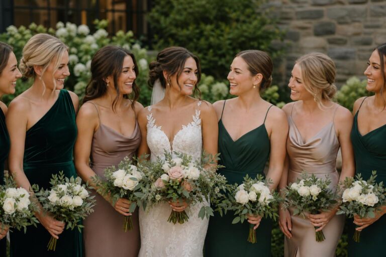
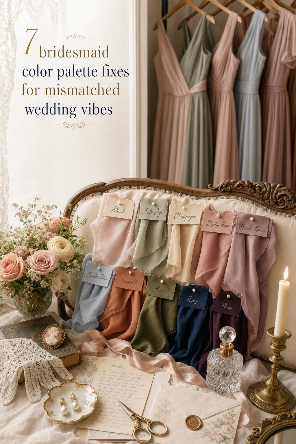
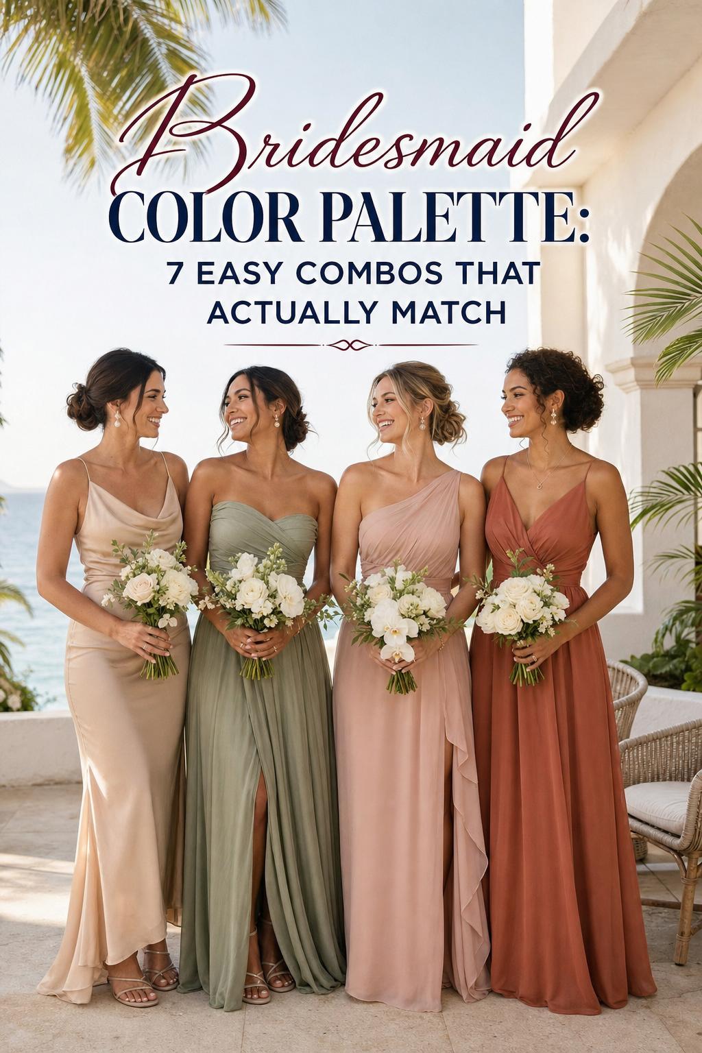
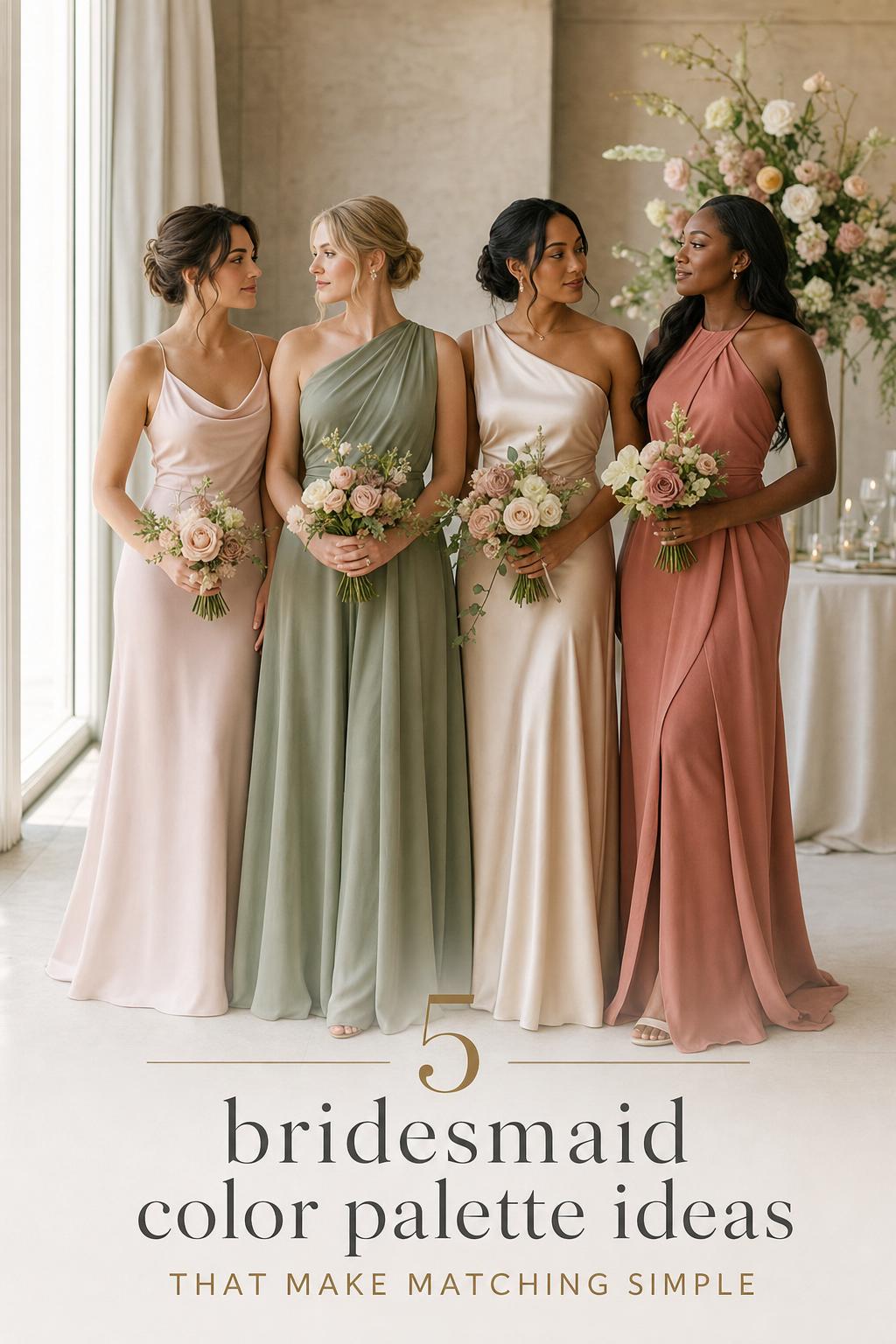
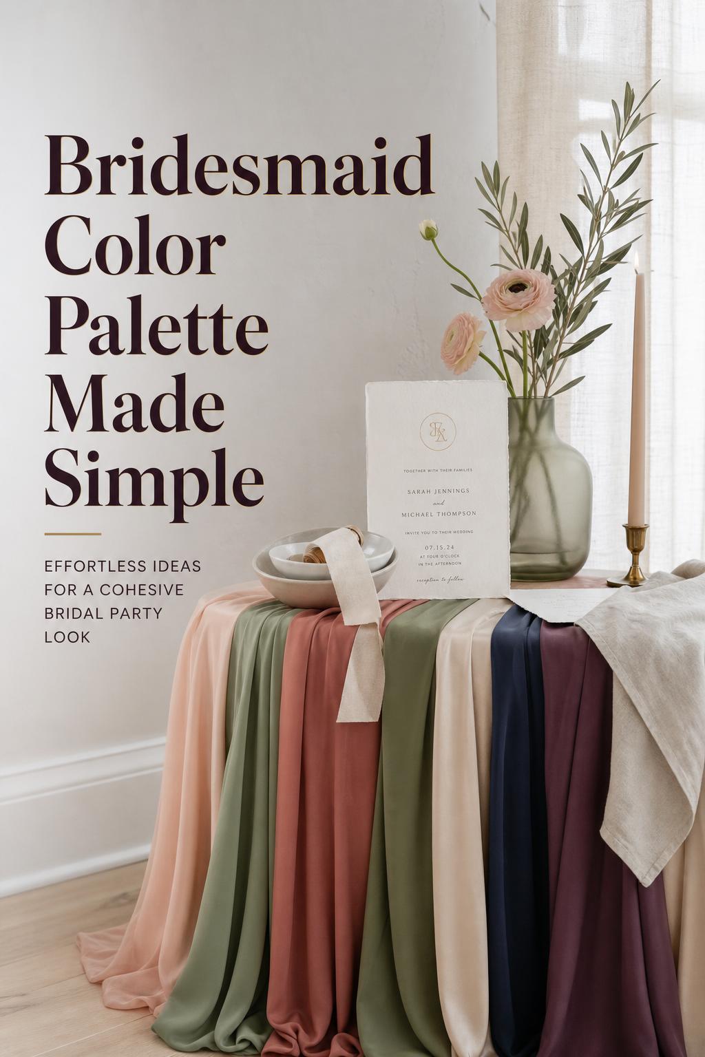
One of the easiest ways to avoid a disjointed bridal party is to think in color families first. Neutrals, pastels, jewel tones, and green families repeatedly appear in strong wedding styling because they give structure without forcing every dress into the exact same tone. A neutral family might include champagne, cream, and soft taupe-inspired shades. A pastel family could build around blush, sky blue, and gentle pinks. Jewel tones open the door to emerald, navy, plum, and wine. Green-led palettes often center on sage, pistachio, or moss.
This approach is especially useful for mix-and-match bridesmaid dresses. When the family is clear, slight variation feels curated rather than accidental.
Use color harmony to guide the mood
Color harmony brings order to inspiration. Complementary pairings create contrast, analogous combinations feel soft and blended, and triadic palettes add more energy. In wedding styling, this matters because the emotional tone of the event often comes from these relationships. A sage and blush palette feels calm and romantic because the colors sit gently together. Terracotta with moss carries more depth and earthiness. Navy with metallic accents feels sharper and more formal, especially in evening light.
If you are torn between several beautiful shades, harmony is often the deciding factor. The palette should feel intentional from ceremony arch to bouquet ribbon to bridesmaid lineup.
Anchor every palette with a neutral
A neutral anchor prevents the dresses, florals, and decor from competing with one another. Even a bold palette usually benefits from a quieter base, whether that shows up in linens, invitations, or secondary tones. This is one of the most practical ways to make a bridesmaid color palette feel elevated rather than busy. It also helps if you are combining multiple dress shades in one bridal party.
Building a bridesmaid color palette from the wedding itself
The most polished palettes rarely begin with the dresses alone. They usually begin with the wedding setting, then move outward to the bridal party. That order matters because bridesmaid colors should support the event’s overall atmosphere rather than fight for attention.
Begin with the strongest visual cue
For some weddings, the cue is the floral direction. Florals are frequently the driver of palette decisions because they naturally combine tone, texture, and seasonality. If the arrangements lean airy and green, sage, cream, and blush may feel obvious and refined. If the florals are darker and moodier, moss, wine, plum, or navy might make more sense.
For other weddings, the cue is the venue style. A coastal setting tends to favor soft neutrals and lighter blues. A garden celebration often welcomes blush, sage, and pastel tones. Rustic settings suit terracotta, moss, and warm neutrals. Ballroom weddings can carry richer jewel tones and more dramatic contrast without feeling heavy.
Choose the primary dress color next
Once the wedding color scheme is clear, select the primary shade for the bridesmaid dresses. This should be the color that appears most consistently across the party. If you are using one color only, it becomes the central visual note. If you are planning variation, it becomes the lead tone that everything else supports.
Retail-oriented planning can be helpful here. Brands such as Azazie, Kennedy Blue, and Ever-Pretty often organize collections by color family, making it easier to compare shades and silhouettes. A “shop by color” format can reveal whether your chosen tone works across multiple fabrics and cuts, which is especially important when bridesmaids are selecting different silhouettes.
Add one or two accents, not five
Many palettes become less elegant when too many colors are competing. A primary shade, a neutral anchor, and one or two accents is usually enough. This still allows room for depth, particularly in florals, linens, and invitations, without making the bridal party look fragmented. If your lead color is blush, a cream neutral and soft green accent often feel balanced. If your lead color is navy, metallics or softer neutral tones can create contrast without visual clutter.
Seasonal direction that solves half the decision
Seasonality is one of the simplest ways to narrow the field. It shapes how color behaves in natural light, how dresses feel in context, and how the palette interacts with decor and florals. When bridesmaids are standing outdoors at golden hour or moving into an evening reception, the season changes the entire effect.
Spring: soft movement, gentle contrast
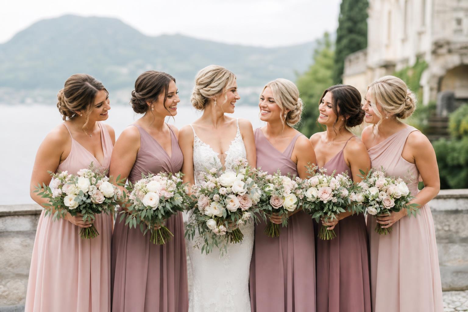
Spring palettes often work best when they echo freshness rather than intensity. Soft pinks, creams, greens, and blush tones create a romantic line-up that feels at home in garden ceremonies and floral-forward celebrations. Pastels are especially effective here because they complement blooming settings and lighter decor without overwhelming the frame.
A spring bridal party also benefits from flexibility in fabric and silhouette. If dresses differ slightly, a pastel family tends to keep the group looking cohesive.
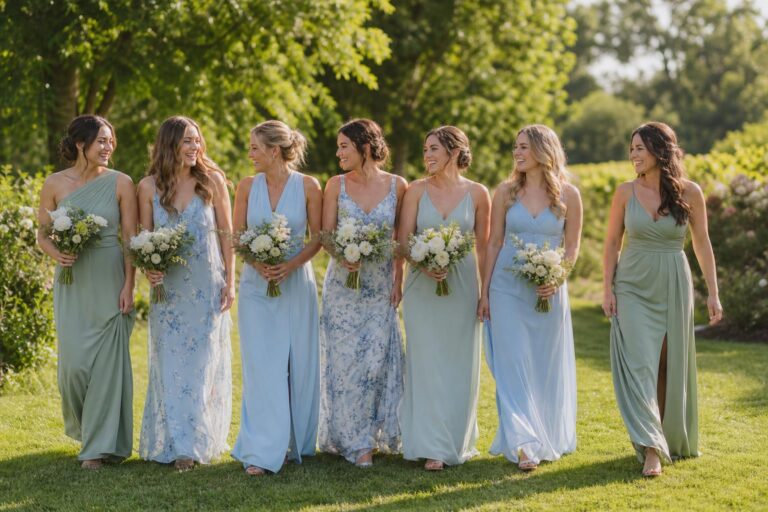
Summer: airy but polished
Summer weddings often call for a palette that can hold up in bright light. Sage, blush, and sky blue appear consistently because they remain soft without washing out. These shades work especially well for outdoor ceremonies, destination celebrations, and coastal venues where the atmosphere is relaxed but still elegant.
In summer, lighter palettes also help with comfort and visual ease. A row of heavy, dark shades under intense daylight can feel too formal for certain settings, while softer green and pastel tones tend to look breathable and refined.
Fall: warmth, depth, and texture
Fall is where terracotta, moss, wine, and richer earthy shades become especially compelling. These colors connect naturally to rustic venues, vineyard settings, and celebrations built around candlelight and textured florals. They also photograph beautifully alongside natural foliage and warmer decor palettes.
The key with fall is balance. One deeper color can be striking, but pairing it with a grounding neutral keeps the bridal party from feeling too dark or visually dense.
Winter: richer tones and evening formality
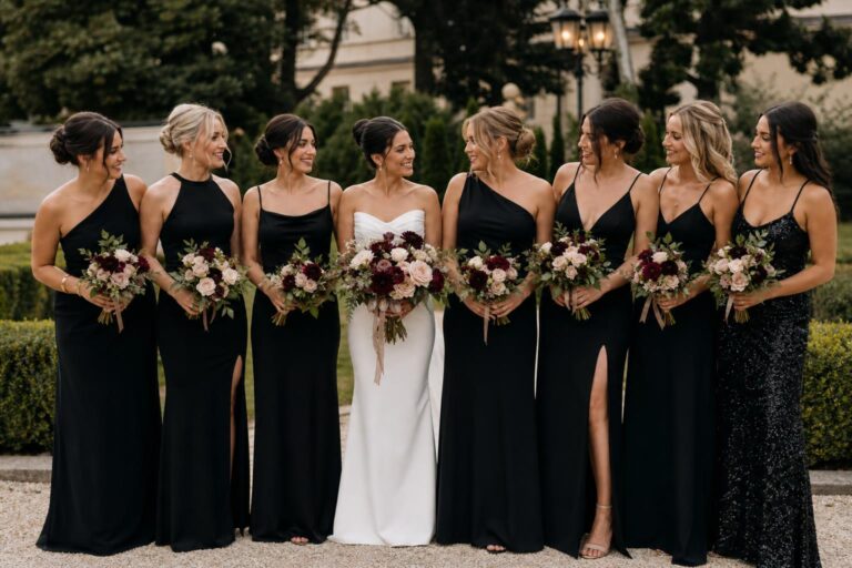
Winter palettes often benefit from contrast and depth. Plum, navy, and metallic accents feel aligned with formal receptions, ballroom settings, and evening celebrations where lighting is lower and textures read more dramatically. Jewel tones are particularly effective because they bring richness without requiring excessive ornament.
For winter weddings, the palette should still feel cohesive with florals and decor. Deep dress colors can be beautiful, but they need breathing room through lighter invitations, metallic details, or neutral tablescapes.
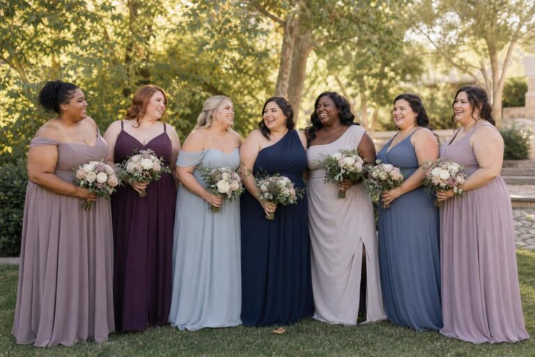
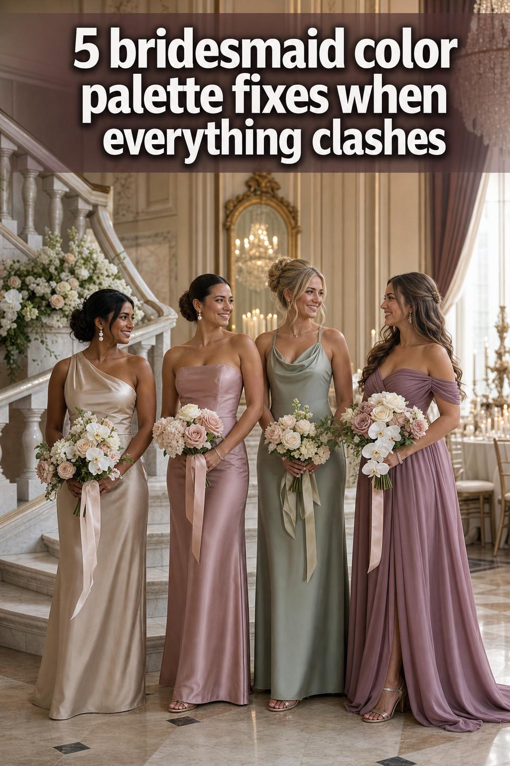
How to make mix-and-match bridesmaid colors look intentional
Mix-and-match dressing remains one of the most practical solutions for bridal parties because it supports different silhouettes, preferences, and wearability needs. It can also go wrong quickly if there is no visual logic. The solution is to control variation rather than eliminate it.
- Keep all dresses within one clear color family, such as sage to moss or blush to rose.
- Repeat one element across the group, whether that is fabric mood, hem length, or overall dress formality.
- Use swatches before ordering so tonal differences feel deliberate, not accidental.
- Let bouquets and decor reinforce the palette so the bridal party feels connected to the setting.
This is where mood boards become useful. A board that includes dresses, florals, invitations, and linens can immediately reveal whether the palette is harmonious or too scattered. Many retailer guides, including those from Azazie, emphasize swatches and visual planning for exactly this reason. The goal is not perfect sameness. It is cohesion.
Skin tone, undertone, and silhouette: the part of palette planning that affects real wearability
A beautiful palette should flatter the people wearing it. That sounds obvious, yet it is often overlooked when visual inspiration takes over. Skin-tone considerations appear repeatedly in practical bridesmaid styling because undertone changes how a color reads on the body. Warm, cool, and neutral undertones can all respond differently to the same dress shade.
Why undertone matters
If a bridal party includes a range of skin tones, a single exact shade can sometimes feel less flexible than a tonal palette within the same family. That is one reason sage, blush, navy, and certain neutrals remain so useful. They are often easier to adapt across a group, especially when dress silhouettes vary.
This does not mean every universal-looking color works for every wedding. It means palette planning should leave room for nuance. A slightly softer or deeper version of the same family may solve the issue more elegantly than forcing every bridesmaid into one precise swatch.
Silhouette changes how color feels
Color intensity and silhouette are closely connected. A richer tone in a dramatic floor-length gown reads more formal than the same tone in a lighter, simpler silhouette. Softer colors often feel effortless in flowing styles, while darker jewel tones can benefit from cleaner lines to avoid feeling too heavy. This is why color should never be chosen in isolation from dress shape.
In practical terms, if your bridal party is choosing their own silhouettes, staying within a cohesive color family becomes even more important. The palette becomes the unifying element when cuts differ.
From dresses to decor: where a palette becomes a full wedding story
The strongest bridesmaid palette never stops at the dresses. It moves through the entire celebration, linking ceremony design, florals, invitations, table settings, and reception mood. That continuity is what makes a wedding feel curated rather than assembled.
Florals as palette drivers
Florals are often the easiest bridge between bridesmaid colors and the rest of the wedding. Greenery-led arrangements naturally support sage, pistachio, and moss tones. Soft floral palettes encourage blush, cream, and pastel pairings. More saturated floral direction can support navy, plum, wine, or jewel-toned dresses. If the bouquets and installations echo the dress palette, the entire bridal party looks more integrated in photographs.
Linens, invitations, and subtle repetition
Table linens and invitations should reinforce the palette rather than duplicate it exactly. Repetition works best when it is subtle. A blush bridesmaid dress does not require blush on every surface, but a cream linen, soft green menu detail, or complementary floral note can quietly tie everything together. This creates depth instead of monotony.
For formal evening settings, deeper dress colors often pair beautifully with lighter paper goods and controlled metallic accents. For daytime weddings, especially garden or coastal events, a softer hand across invitations and linens helps the bridal party feel naturally connected to the scene.
Venue-specific palette thinking that actually helps
One of the most practical ways to refine a palette is to imagine where the dresses will be seen most clearly. Venue style changes how color behaves, and a good palette respects that.
Coastal celebrations and soft neutrals
A coastal wedding usually benefits from lightness. Soft neutrals, airy blues, and restrained pastels feel natural against open skies and brighter surroundings. A heavy palette can work, but it often needs very careful styling to avoid looking out of place. If the setting is breezy and sunlit, the bridesmaid color palette should reflect that ease.
Garden weddings with blush and sage
Garden venues are almost made for blended floral tones. Sage and blush remain enduring because they sit comfortably among greenery, fresh florals, and softer decorative details. They also support variation across the bridal party, which makes them practical as well as pretty.
Ballroom receptions and jewel-tone structure
Ballroom weddings can carry more contrast and richer colors without losing elegance. Navy, emerald, plum, and other jewel tones often feel right at home beneath chandeliers and evening lighting, particularly when invitations, linens, and florals offer softer counterpoints. In these settings, the bridal party can become part of the room’s architecture rather than a separate visual moment.
Rustic and vineyard settings with earthy warmth
Terracotta, moss, warm neutrals, and wine tones often feel especially convincing in rustic venues and vineyard celebrations. These palettes mirror the landscape rather than sit on top of it. If the wedding includes natural textures and a slightly more relaxed atmosphere, earthy color families usually feel more authentic than icy or highly polished shades.
Practical tools that prevent expensive color mistakes
Even the prettiest palette can falter if it exists only in imagination. Practical planning tools translate inspiration into something testable, which matters when multiple dresses, fabrics, and vendors are involved.
- Order swatches before approving a final dress color.
- Build a mood board that includes dresses, florals, decor, and invitation samples.
- Compare shades in daylight and evening light when possible.
- Check whether the chosen color is available across the silhouettes your bridal party needs.
- Review the palette as a group, not one item at a time.
Retailer resources can be genuinely helpful at this stage. Azazie’s swatch-led guidance, Kennedy Blue’s trend-led color categories, and Ever-Pretty’s broader styling advice all point toward the same practical truth: seeing tones side by side solves uncertainty faster than guessing from a screen.
Tips from a stylist’s perspective
When palette decisions stall, the issue is usually not a lack of beautiful options. It is a lack of hierarchy. Decide what matters most first: season, venue, florals, or dress wearability. Once one of those leads, the palette becomes easier to shape around it.
Another useful adjustment is to separate inspiration from implementation. A mood board may include several shades for atmosphere, but the actual bridesmaid dresses often need fewer colors than the board suggests. That editing step is where many palettes become more refined.
Finally, pay attention to how the dresses will feel over the course of the day. A bridesmaid lineup should look polished during the ceremony, but it also needs to function through photos, walking, dining, and dancing. A palette that supports varied silhouettes usually leads to better comfort and stronger overall styling.
Where trends fit into the decision
Trend-driven inspiration can be useful, especially when it helps narrow down color families. Current direction across wedding content often highlights 2026 favorites such as sage, pistachio, moss tones, neutrals, soft pastels, and classic jewel tones. These shades appear repeatedly because they are flexible enough to work across seasons, venues, and shopping options.
That said, trend relevance should support the wedding rather than override it. A trending green family may be beautiful, but if the venue, florals, and overall wedding color palette lean in another direction, forcing the trend can make the bridal party feel disconnected. The best use of trends is selective. Let them sharpen your choices, not replace your own event logic.
Common mistakes that make a palette feel less polished
Choosing a dress color before defining the wedding palette
This is one of the most common missteps. It happens because dress shopping feels immediate, while decor and florals may still be developing. The result can be a bridesmaid color that looks lovely on its own but disconnected from the event. Start with the broader wedding color scheme first.
Confusing variety with cohesion
Mix-and-match styling works best when variation is controlled. Too many unrelated shades can make the bridal party appear visually scattered, especially in photos. Staying within a clear color family is the safer and more elegant route.
Ignoring skin tones and silhouette differences
A single exact color may not flatter every bridesmaid in the same way. Ignoring undertone and shape can make the lineup look less balanced than it could. Tonal flexibility often solves this more gracefully than insisting on perfect uniformity.
Relying only on digital images
Screen color is not enough for a final decision. Swatches and mood boards remain essential because they show how a palette behaves in real conditions and alongside other wedding elements.
A thoughtful way to finalize your palette
If you feel stuck between several options, return to the essentials. Which palette suits the season? Which one supports the florals? Which one allows flexibility across silhouettes? Which one still feels beautiful when imagined in the venue rather than in isolation? Those questions usually reveal the right direction faster than endless scrolling through color inspiration.
A successful bridesmaid color palette should feel cohesive, flattering, and believable within the wedding’s world. Whether you gravitate toward blush and sage for a garden ceremony, terracotta and moss for a fall vineyard, or navy and metallic accents for a formal winter reception, the strongest choice is usually the one that connects dresses, decor, and atmosphere with quiet confidence.
FAQ
How do I choose a bridesmaid color palette that matches the wedding color scheme?
Start with the strongest visual element of the wedding, usually the florals, venue style, or overall decor direction, then choose a primary dress color that supports it. Add a neutral anchor and no more than one or two accent colors so the bridesmaid dresses feel connected to the full wedding palette rather than separate from it.
What are the most versatile color families for bridesmaid dresses?
Neutrals, pastels, jewel tones, and green families are the most versatile because they work across different seasons, settings, and dress silhouettes. Shades such as blush, sage, navy, emerald, champagne, terracotta, moss, and plum appear often because they adapt well to both styling and decor coordination.
How can I mix and match bridesmaid colors without making the bridal party look random?
Keep all dresses within one clear color family and repeat at least one unifying element, such as fabric mood, dress length, or formality. Swatches and mood boards are especially helpful because they let you compare tones together before ordering, which makes the final lineup feel curated instead of accidental.
Which bridesmaid colors work best by season?
Spring usually favors soft pinks, creams, blush, and greens, while summer often suits sage, blush, and sky blue. Fall tends to work well with terracotta, moss, and wine, and winter is especially strong for plum, navy, metallic accents, and richer jewel tones.
Should bridesmaid dresses match exactly or can they be different shades?
Either approach can work, but different shades often feel more flattering and practical when the bridal party includes varied skin tones and silhouette preferences. The key is to keep the shades related, so the dresses still read as one intentional palette in photographs and in person.
How important are skin tones when choosing bridesmaid colors?
They are very important because undertones affect how a color reads on each person. Warm, cool, and neutral undertones can respond differently to the same shade, so allowing tonal flexibility within a color family often creates a more flattering and balanced bridal party.
Do I really need swatches and a mood board?
Yes, if you want to avoid unnecessary guesswork. Swatches show how a color looks in real light and across fabrics, while a mood board helps you see whether the dresses, florals, invitations, and linens feel cohesive together. This is one of the simplest ways to prevent expensive color mistakes.
Are sage and blush still good choices for bridesmaids?
Yes, because they remain both romantic and practical. Sage and blush are especially effective for garden and spring-to-summer weddings, and they pair easily with florals, greenery, soft decor, and mix-and-match dress styling.
Which brands are helpful when shopping by bridesmaid dress color?
Brands and publishers often referenced for color-led bridesmaid shopping and inspiration include Azazie, Kennedy Blue, Ever-Pretty, The Knot, WeddingWire, Bridal Guide, Destify, Bride Lifestyle, The Wed, and Pix Wedding. Retailers are especially useful for swatches and color categories, while editorial sites can help with palette ideas and seasonal styling direction.