Burgundy Winter Wedding: Build a Cohesive Color Capsule
A burgundy winter wedding can feel rich, romantic, and distinctly yours, but the color becomes difficult when every decision uses the same deep red. Bridesmaid dresses, flowers, stationery, candles, linens, and cake can all be beautiful individually and still make the room feel heavy together.
The solution is to treat burgundy as the anchor of a small design system. Give it a job, then choose supporting shades, textures, and light levels that make the whole celebration easier to plan. This capsule approach helps you move from a mood board to real decisions without making every item match.
Build the Palette Architecture Before You Choose Details
Start with the roles in the palette rather than a list of favorite colors. Burgundy is deep and visually assertive, so it needs lighter surfaces and quieter transitions around it. A useful capsule has four roles: one anchor, one supporting color, one light neutral, and one small accent. You can add a grounding tone if the venue needs it, but five colors is usually enough for a wedding that should feel edited.
The anchor is burgundy. It may appear in attendant attire, flowers, velvet ribbon, menus, napkins, or a statement accessory. It does not need to appear in every category. In fact, the color often feels more intentional when it is repeated in three or four visible places and allowed to rest elsewhere. Decide whether your burgundy is closer to wine, cranberry, oxblood, or a brown-red. Those undertones can look very different beside ivory, blush, greenery, and gold.
Your wedding look is only the beginning.
Keep your guest list, vendors, timeline, and every important detail together with Zarellea — so your day feels as considered as your style.
The supporting color changes the mood. Forest green makes the palette botanical and grounded. Navy makes it formal and slightly cooler. Dusty rose softens the contrast and gives the flowers a romantic bridge. Plum creates a tonal, evening feeling. Choose one main support instead of asking every secondary color to compete with the burgundy. A narrow family of related shades is easier for a florist, stationer, rental team, and wedding party to interpret.
The light neutral creates breathing room. Ivory, warm cream, soft white, champagne, or pale stone can keep the palette from becoming visually dense. Use the neutral on the invitation background, ceremony fabric, table linen, cake, or bridal accessories. It also gives photographs a clear light point. A useful reference roundup from Martha Stewart’s winter palette guide shows how deep winter shades become more versatile when they are paired with lighter tones and controlled contrast.
The accent is the smallest role. Gold, antique brass, black, silver, or a muted metallic can sharpen the design, but it should not become a second anchor. Gold with burgundy feels candlelit and formal. Black feels modern and graphic. Silver feels crisp, especially beside icy white or navy. If you want a warm winter room, antique brass is often gentler than bright yellow gold because it connects naturally with wood, stone, and candlelight.
- Romantic capsule: burgundy, dusty rose, warm ivory, muted sage, and antique gold.
- Formal capsule: burgundy, navy, crisp ivory, charcoal, and brushed gold.
- Botanical capsule: burgundy, forest green, cream, brown, and aged brass.
- Modern capsule: burgundy, soft white, black, pale blush, and one reflective silver detail.
Test your colors in the venue’s actual light before you approve the final palette. A burgundy fabric that looks berry-red in daylight may read almost brown under amber bulbs. Greenery can look black in a dim room, while blush may disappear beside a strong red. Place fabric swatches, ribbon, a flower sample, and a paper proof together near a window and under your reception lighting. You are not looking for exact sameness. You are checking whether the transitions feel deliberate.
Assemble the Burgundy Winter Wedding Capsule
Once the color roles are clear, build the wedding in layers. Start with the elements guests see repeatedly, then add details that support those anchors. The goal is not to place burgundy everywhere. It is to create a visual rhythm that guests can recognize from the ceremony through the last table.
Attire: choose where the deepest color belongs
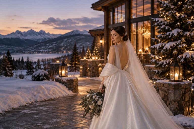
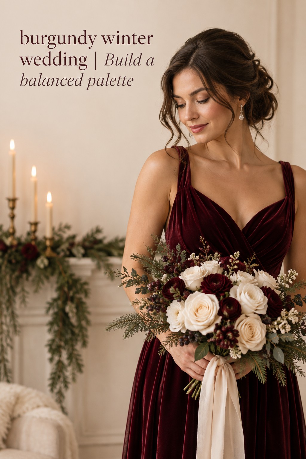
Burgundy bridesmaid dresses make a strong anchor because they frame the couple in photographs and establish the color immediately. If the dresses are deep and uniform, keep the flowers lighter or more textural so the group does not become one dark block. Cream bouquets with burgundy accents can look airy. Burgundy bouquets with cream ribbons can look more dramatic. Both work when the balance is decided before the floral order.
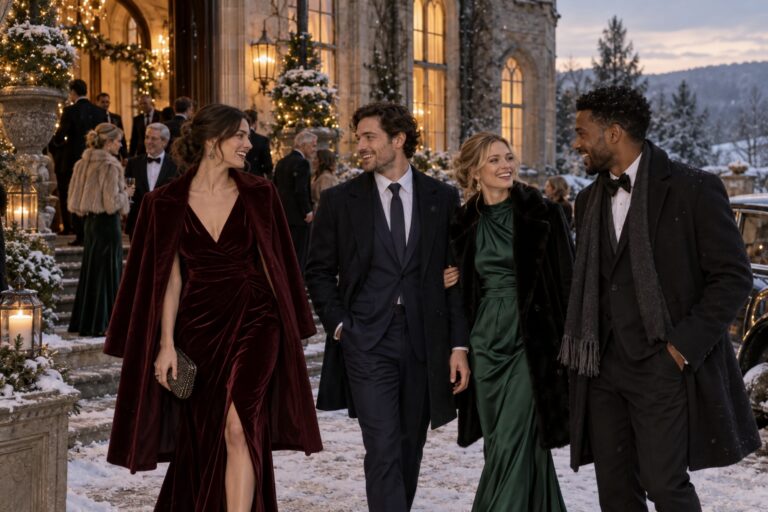
You can distribute the color more gently through velvet shoes, a groom’s pocket square, a tie, a shawl, hair ribbons, or a pair of statement earrings. These smaller placements are especially useful when the venue or dress code already contains strong colors. Ask the wedding party to send fabric photos in daylight, because names such as wine, merlot, and burgundy are not standardized across brands. Coordinate the impression, not a perfect digital color match.
Flowers: build contrast with shape and texture
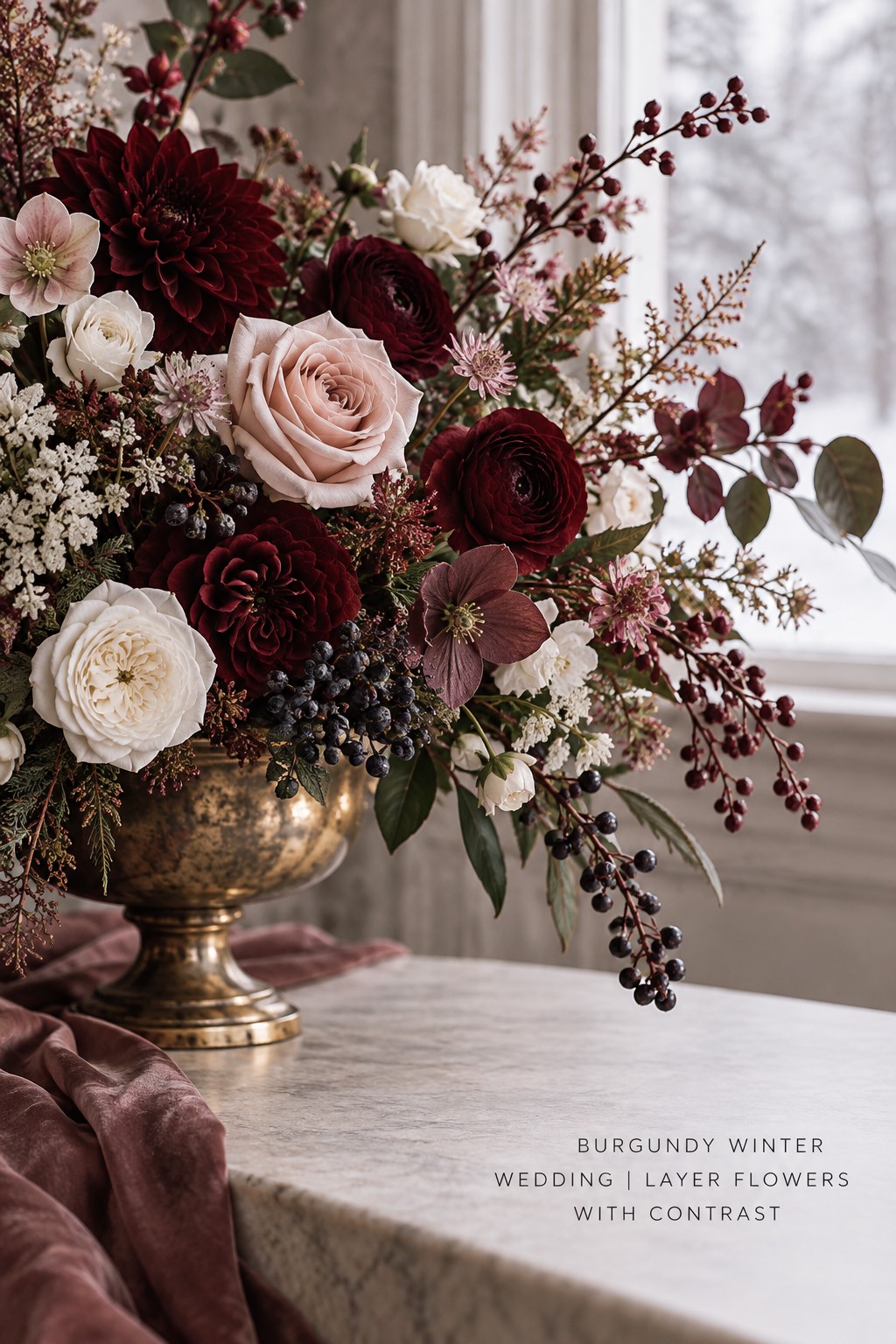
Flowers are where burgundy can become flat if every bloom has the same dense tone. Ask your florist to create contrast through petal shape, scale, and surface. Deep roses or carnations can sit beside cream blooms, dusty berries, pale blush flowers, seed pods, branches, or soft foliage. A few dark flowers often create more impact than an entire arrangement filled with the darkest available red.
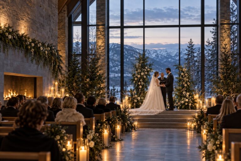
Choose one floral direction for the main visual language. A romantic capsule may use rounded flowers, loose ribbons, and gentle blush transitions. A formal capsule may use clean lines, dark foliage, and architectural vessels. A botanical capsule may emphasize branches, herbs, berries, and uneven organic shapes. Your flower plan should repeat the palette’s roles, not simply repeat one color.
Paper goods: use the neutral as a canvas
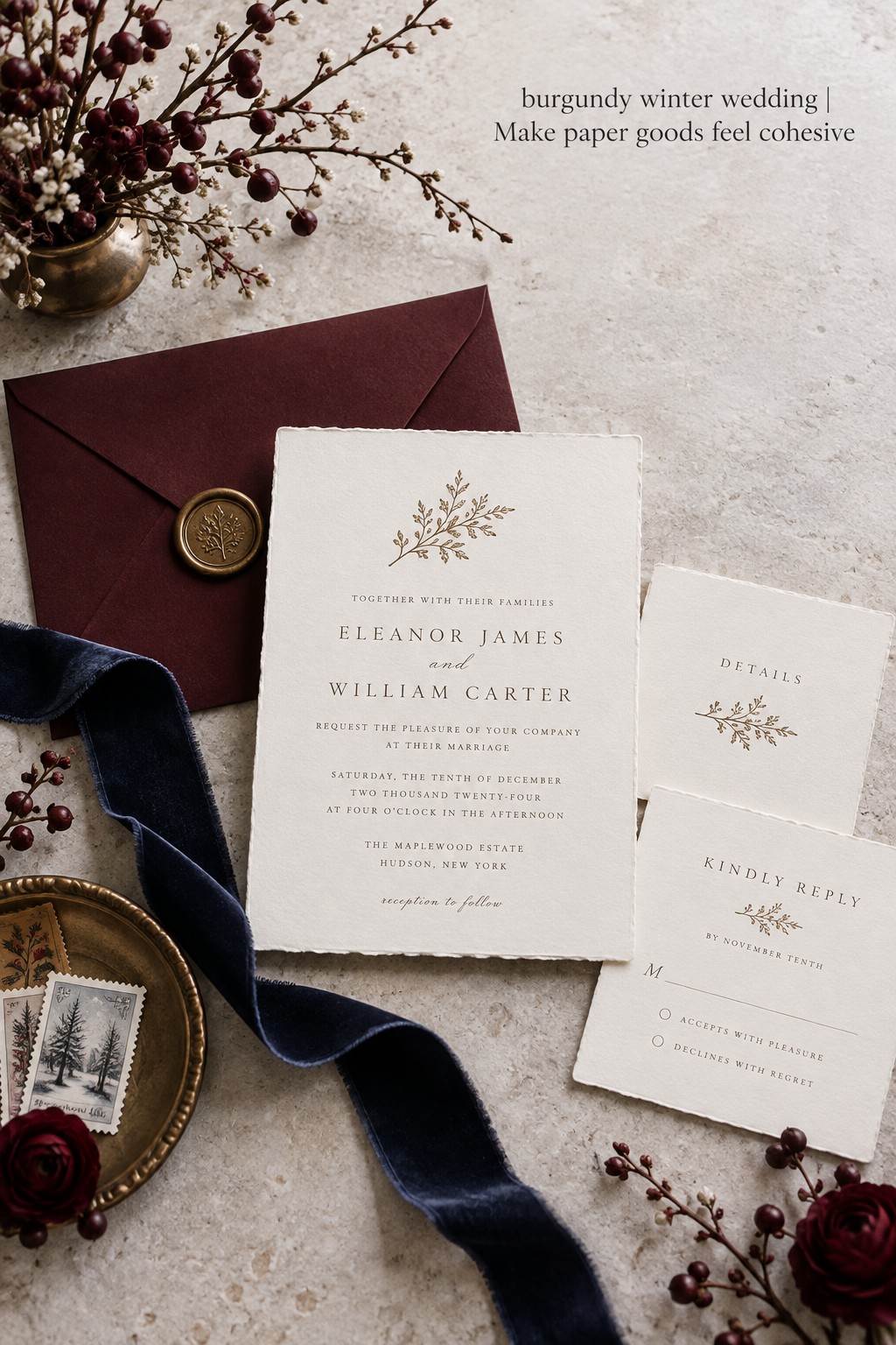
Invitations, menus, escort cards, and programs are a natural place to control intensity. A burgundy envelope, border, monogram, or printed text can carry the anchor while the paper remains ivory or warm white. If the entire invitation is dark, make sure the type remains readable and that the stationery still feels connected to the ceremony and reception materials.
Repeat one small decision across the suite. It could be a burgundy edge, a fine botanical illustration, an antique-gold line, or a ribbon closure. Repetition creates cohesion faster than adding more colors. Bring the finished invitation to your florist and rental appointment so vendors can see the exact undertone and finish rather than relying on a phone screenshot.
Tables and lighting: let the room carry the mood
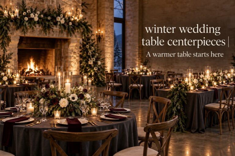
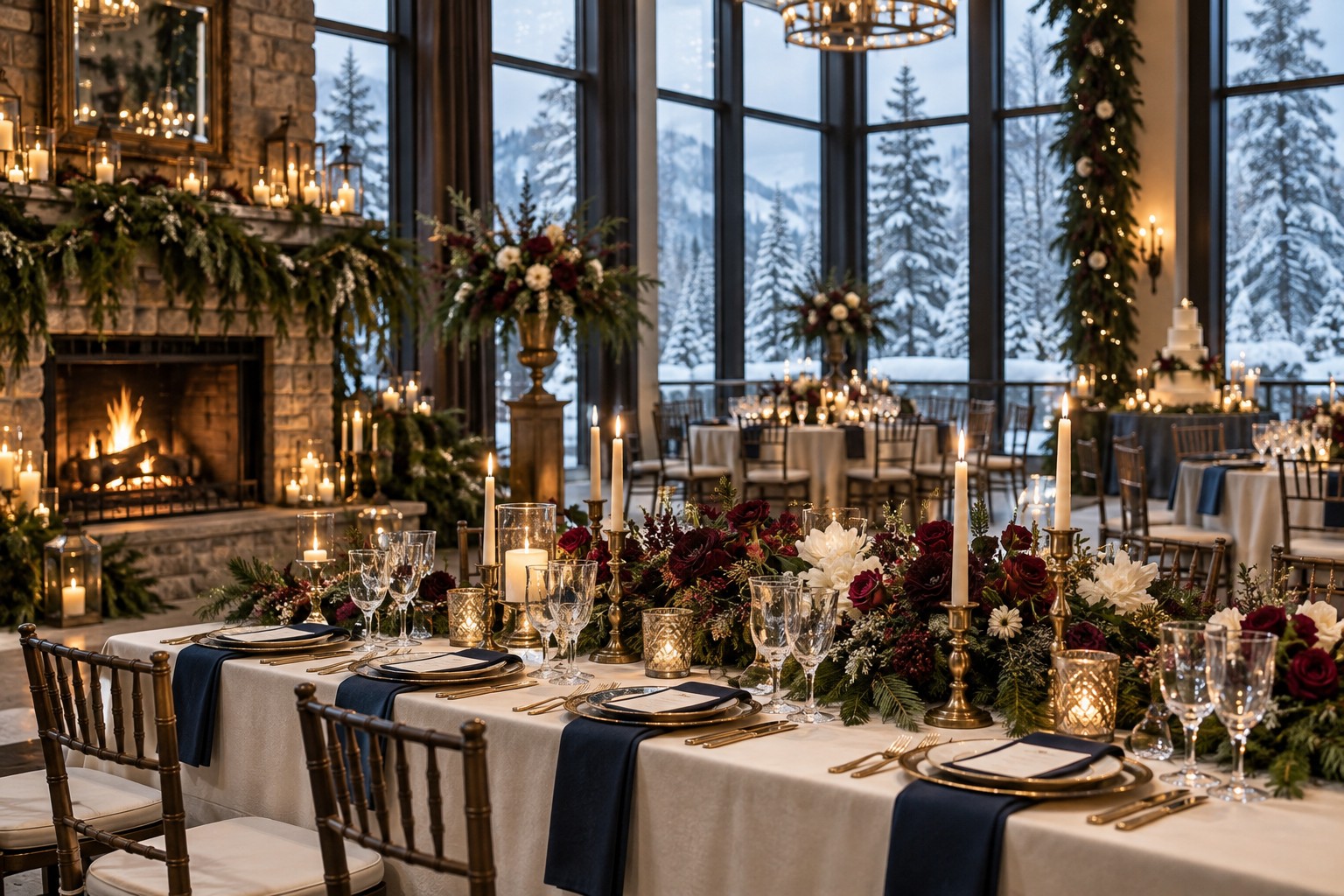
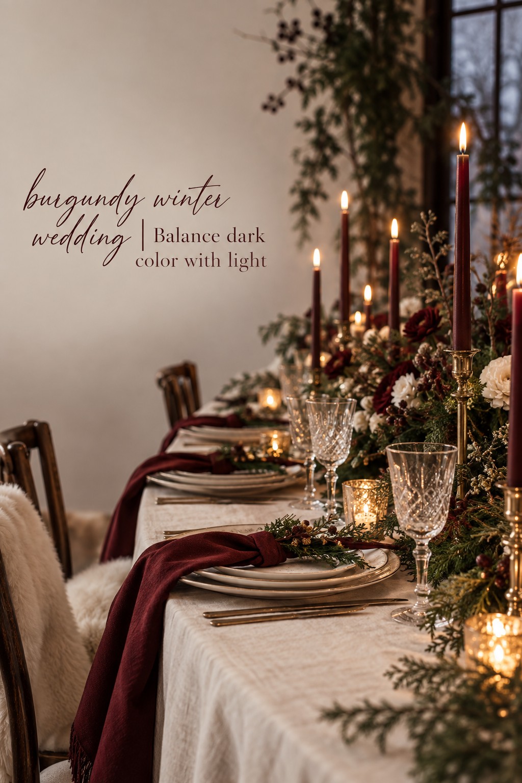
A burgundy winter wedding usually benefits from a clear light strategy. Cream linens, pale napkins, light menus, or warm wood can keep the table from feeling closed in. If you love burgundy linens, use them on a smaller number of tables or balance them with light plates, pale flowers, and open candleholders. Dark fabric absorbs light, so the shape of the table and the glow of the room become part of the palette decision.
Candlelight can make burgundy look elegant, but too many amber sources can shift every color toward orange or brown. Ask for a sample table under the planned lighting. Check how the flowers, napkins, glassware, and menus look from standing height, across the room, and in a phone photograph. A palette is successful when the guest experience and the images both retain their intended contrast.
Cake and small details: repeat without copying
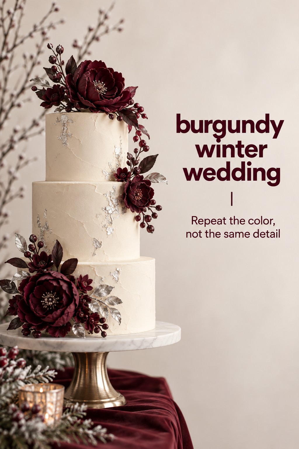
The cake does not need burgundy frosting. A cream cake with burgundy sugar flowers, a wine-colored ribbon, berry accents, or a painted detail may connect more naturally with the rest of the room. The same principle works for favors, cocktail napkins, signage, and lounge pillows. Give each small item one job, such as repeating the anchor, adding texture, or carrying the metallic accent.
Keep the bridal bouquet, ceremony backdrop, head table, cake, and invitation suite from all becoming identical compositions. Repetition should feel like a shared vocabulary, not a copy-and-paste exercise. Use the same burgundy in different materials and amounts so the celebration feels collected over time.
Choose a Complete Combination for Your Wedding Mood
If you are still unsure how to move from color roles to real choices, start with the mood you want guests to feel. These three combinations show how one burgundy anchor can behave differently without losing its winter identity.
Warm romantic: burgundy, blush, cream, sage, and brass
Choose this combination when you want softness, candlelight, and an inviting sense of romance. Put burgundy in the attendant dresses, ribbon, and selected flowers. Use blush as a bridge in bouquets and centerpieces, then let cream carry the paper, cake, and larger light surfaces. Sage or muted green keeps the palette from becoming too sweet, while aged brass adds warmth without turning the room into a holiday display.
This capsule suits a historic venue, a winter greenhouse, a restaurant reception, or a room with warm wood. Keep the flower shapes varied and avoid bright red berries if you do not want a Christmas association. A softly textured table linen and loosely tied ribbon can make the design feel personal rather than overly formal.
Old-world formal: burgundy, navy, ivory, charcoal, and gold
This direction is more structured and works well for a ballroom, library, hotel, or black-tie evening. Use burgundy in the florals and selected attire, navy in suits or stationery, and ivory as the visual reset. Charcoal can ground signage, menu type, or a tailored accessory. Keep gold focused on frames, flatware, candleholders, or a fine paper detail so it reads as polish rather than sparkle.
The key is to control the ratio of dark surfaces. If the attendants, suits, table linens, and flowers are all deep, introduce ivory in the ceremony fabric, menus, candles, and cake. Clean silhouettes and restrained floral arrangements will keep this capsule from feeling theatrical.
Modern botanical: burgundy, forest green, cream, brown, and silver
Use this combination when you want a moody winter wedding that still feels fresh. Let forest green arrive through foliage, velvet, or one supporting attire choice, then use burgundy in flowers, stationery, and a few fabric details. Cream creates the light field. Brown can appear in wood, leather, menu stock, or natural vessels. A small silver accent, such as glass, flatware, or a clean line on the paper, keeps the palette from becoming too warm.
This capsule needs careful lighting because green and burgundy can both become very dark. Use open candleholders, pale plates, clear glass, and enough cream space around the centerpiece. Keep the forms slightly asymmetrical and let the materials do the talking. Texture will make the palette feel layered without adding another color.
When you compare the three directions, notice that the same anchor changes through its neighbors. Burgundy is not the entire personality of the wedding. It is the thread that connects the choices. A useful styling overview from CV Linens’ winter decor guide also emphasizes that palette, texture, lighting, and organic accents work together, which is why color alone cannot finish the room.
Fix the Mistakes That Make Burgundy Feel Heavy
The first mistake is treating the color name as a precise specification. Burgundy can lean purple, brown, blue, or bright red. Ask vendors for physical swatches or daylight photos, and choose one lead undertone. Small variations can be beautiful, but uncontrolled variations can make the wedding look accidental.
The second mistake is repeating the anchor in every visible category. If burgundy appears in dresses, tablecloths, flowers, menus, cake, candles, signage, and lounge furniture, the eye has nowhere to rest. Remove one or two placements before adding a new color. The room often becomes more elegant when the anchor is allowed to pause.
The third mistake is confusing seasonal with holiday-specific. Burgundy, evergreen, berries, ribbon, and candlelight can quickly create a Christmas reference if they are all used together with bright red and metallic sparkle. To keep the wedding winter-focused, use ivory, stone, blush, navy, or brown, and choose one restrained botanical cue rather than a collection of holiday symbols.
The fourth mistake is choosing a palette that belongs only to the mood board. Your design must survive the venue, the guest attire, the photographs, and the budget. A complicated combination may require custom flowers, dyed ribbon, specialty linens, and several rounds of matching. Simplify early. A strong capsule usually has one memorable color, one dependable neutral, and a few repeatable materials.
- Can I name the exact role of burgundy in each major category?
- Is there enough light neutral space for photographs and readable paper?
- Do the flowers add shape and texture instead of only more dark color?
- Does the palette still work under the venue’s real lighting?
- Have I limited the accent color to details that guests will notice?
- Could a vendor understand the plan from one page of swatches and notes?
Complete this review before ordering stationery, attire, or rentals. Put the final swatches beside a venue photograph, a dress or suit reference, and one floral proposal. If one item looks disconnected, adjust its role rather than adding another shade. The best burgundy winter wedding designs feel generous because every deep color is balanced by light, texture, or space.
FAQ
What colors go well with a burgundy winter wedding?
Burgundy pairs well with ivory, cream, blush, forest green, navy, plum, charcoal, brown, antique gold, and restrained silver. Choose one main supporting color and one light neutral first. Then use a metallic or dark grounding shade as a small accent instead of giving every color equal weight.
How can I keep a burgundy wedding from looking like Christmas?
Use burgundy with ivory, blush, navy, stone, brown, or muted greenery rather than combining bright red, traditional green, and heavy sparkle. Avoid repeating holiday symbols across the flowers, stationery, and decor. A single winter texture, such as velvet or candlelight, usually feels more editorial than many seasonal motifs together.
Should bridesmaids wear burgundy for a winter wedding?
They can, especially when the bridal outfit is light and the flowers use cream or blush for contrast. If the dresses are very dark, keep bouquets, ceremony fabric, or table details lighter so the wedding party does not photograph as one solid block. Always compare the actual fabric swatches in daylight before ordering.
What flowers work in a burgundy winter wedding palette?
Deep roses, carnations, berries, and selected seasonal flowers can carry burgundy, while cream blooms, blush flowers, branches, seed pods, and varied foliage create contrast. Ask your florist to vary shape and texture rather than filling every arrangement with the darkest blooms. Use ribbon or vessels to repeat the color when a flower cannot match the fabric exactly.
Is burgundy suitable for a formal winter wedding?
Yes. Burgundy can look especially polished with ivory, navy, charcoal, candlelight, and brushed gold. Keep the forms clean, limit competing accents, and use light surfaces on the table or stationery so the palette feels formal rather than visually crowded.
How many colors should a burgundy winter wedding use?
Start with three main roles: burgundy as the anchor, one supporting color, and one light neutral. Add one small accent, such as gold, silver, black, or brown, only when the venue or materials need it. A focused four- or five-color capsule is easier to coordinate than a long list of shades.