Christmas Wedding Invitations: Build a Beautiful Suite
A December wedding begins in the mailbox. Before guests see the ceremony arch, hear the music, or walk into a candlelit reception, they hold the first physical expression of your celebration. That small stack of paper needs to feel festive, but it also needs to answer practical questions quickly. Is this an unmistakably Christmas wedding, a quietly winter celebration, or a holiday-season event designed for guests with different traditions?
The easiest way to make Christmas wedding invitations feel polished is to treat them as a capsule rather than a pile of extras. Build one strong visual language, choose only the cards that solve a real guest need, and repeat the same decisions from save-the-date through day-of stationery. A beautiful suite is not the one with the most pieces. It is the one where every piece belongs, every important detail is easy to find, and the mood feels unmistakably yours.
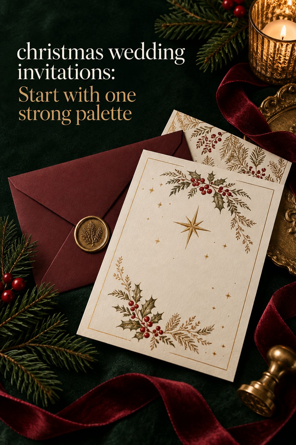
The Christmas invitation capsule: essential building blocks
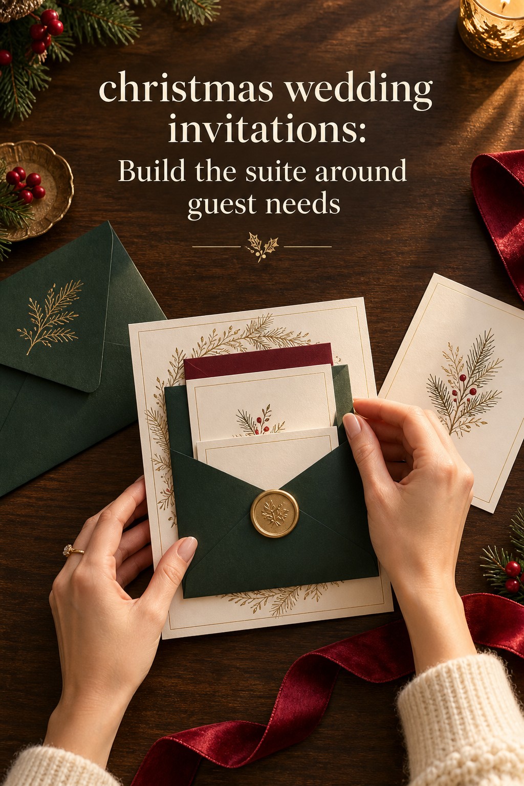
Start with the smallest complete system. For many weddings, that means a main invitation, an RSVP path, an outer mailing envelope, and one details card. Add a reception card, accommodations card, weekend events card, or directions card only when the event creates a specific information problem. This keeps the suite easier to assemble and prevents important details from disappearing inside decorative layers.
Your wedding look is only the beginning.
Keep your guest list, vendors, timeline, and every important detail together with Zarellea — so your day feels as considered as your style.
The main invitation is the statement piece
The main card should carry the core facts: who is hosting, the couple’s names, the date, the ceremony time, the ceremony location, and a clear indication of what follows. If the ceremony and reception happen in the same place, a simple reception-to-follow line may be enough. If guests must travel to another venue, use a separate reception card or details card so the main invitation can remain legible.
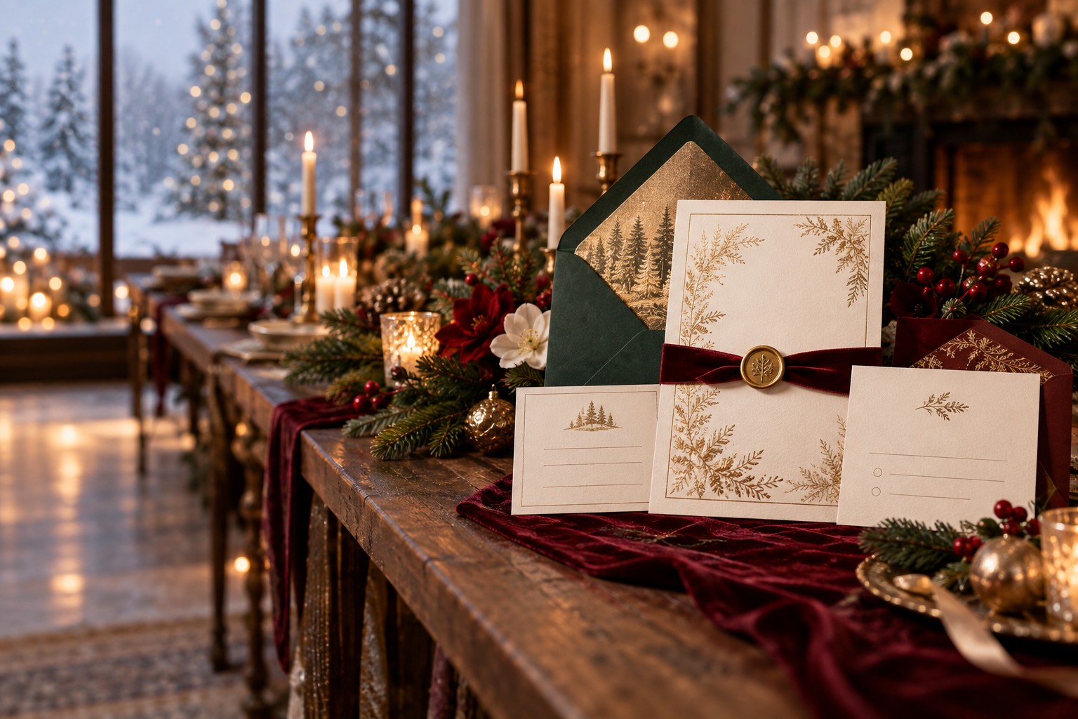
Think of the main card as the cover of a small book. It establishes the tone through paper, type, color, and spacing. A deep green card with crisp white ink feels festive and dramatic. Warm ivory with wine-colored type feels heritage-inspired. Pale blue, silver, and generous white space create a winter-night mood without making the wedding look like a Christmas party. The content remains clear while the design tells guests how to read the occasion.
The RSVP path should be effortless
Choose a response method that works for your actual guest list. A paper RSVP card with a stamped envelope is familiar and welcoming, especially for older relatives or guests who prefer physical mail. An online RSVP can reduce paper and simplify updates, but the URL or QR code should be easy to locate and test on several phones before printing. If guests are choosing meals, sharing dietary needs, or selecting events, make the response path specific rather than sending them to a vague homepage.
Details cards solve the holiday logistics
Christmas weddings often require more planning than a typical local weekend. Hotels may fill quickly, airports can be busy, and holiday travel can involve weather disruptions. A details card can hold the wedding website, room-block information, shuttle times, parking instructions, dress code, and a short note about outdoor portions of the day. You do not need to print every answer. You do need to make the next step obvious.
- Reception card: Use it when the reception is at a different address or begins at a distinctly different time.
- Accommodations card: Include hotel names, booking deadlines, transportation details, and any room-block code.
- Weekend events card: Add a welcome dinner, Christmas Eve gathering, brunch, or farewell event that requires an RSVP.
- Directions card: Useful for rural venues, winter roads, multiple entrances, or locations with limited cell service.
- Website card: A small card can point guests to the full schedule, registry, travel updates, and attire notes without crowding the invitation.
Keep registry information off the main invitation. A wedding website is the more graceful place for it, and a details card can provide the website address. The same principle applies to long personal stories, extensive schedules, and instructions that only some guests need. The capsule works when the main card remains the calm center.
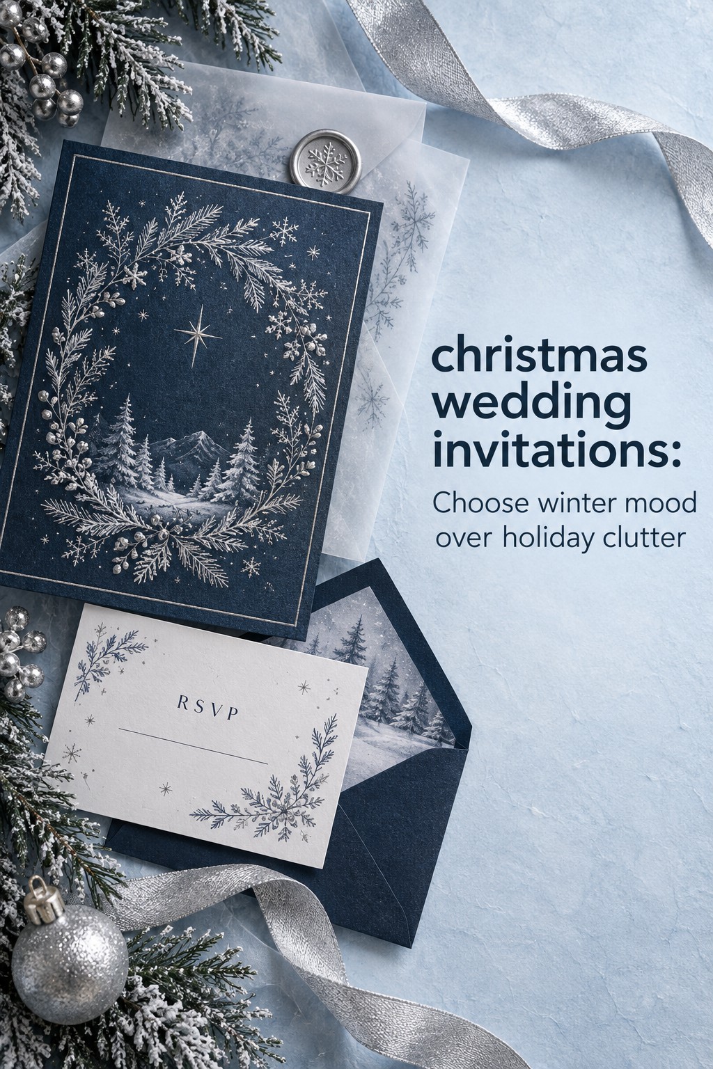
Choose one visual direction and build around it
Before choosing a font or ordering samples, place your wedding on a spectrum. At one end is a fully Christmas-forward celebration with red, green, ornaments, or religious references. In the middle is a winter holiday look using evergreens, candlelight, metallics, snow, or deep seasonal color without relying on Christmas symbols. At the other end is a holiday-neutral winter wedding that happens in December but speaks through atmosphere rather than a specific tradition.
Classic Christmas: red, green, and warm metallics
A classic Christmas direction works best when it is edited. Choose one dominant seasonal color, one supporting neutral, and one metallic accent. Deep red with warm ivory and antique gold feels more like an elegant dinner than a retail display. Forest green with cream and brass creates a botanical mood. Navy with red and gold can feel traditional while remaining appropriate for an evening ballroom.
Use seasonal motifs as punctuation. A fine-line fir branch, a tiny holly detail, a star, or a custom venue crest can appear on the invitation corner, envelope liner, or RSVP card. Repeating the motif at full size on every piece usually makes the suite feel busy. Let the paper and spacing carry as much of the design as the illustration.
Winter editorial: silver, blue, and quiet glow
Winter editorial Christmas wedding invitations suggest the season without describing it literally. Try midnight blue with silver ink, icy blue with slate type, or warm white with a pale gray border. A watercolor frost wash, constellation pattern, or abstract branch can create atmosphere without competing with the names and date. This direction suits couples who want a December setting but do not want every guest to interpret the event as a Christmas-themed party.
Because the palette is quieter, material quality matters. A lightly textured stock, a vellum wrap, or a restrained foil accent can give the invitation depth. Do not use the palest possible text on a pale background. Contrast is part of hospitality, especially for older guests or anyone reading the invitation in low light.
Holiday-neutral: texture, typography, and place
A holiday-neutral suite can still feel deeply seasonal through texture and setting. Use warm ecru, stone, charcoal, pine, or muted brass, then let a venue sketch, a border, or an old-style serif establish the mood. A winter wedding in a historic inn might use a crest and a laid paper. A modern city celebration might use oversized names, a clean sans serif, and a single line drawing of the venue.
This option is especially thoughtful when guests celebrate different holidays or when the couple wants the invitation to remain useful after December. The design can still say candlelight, cold air, and gathering without asking every guest to share one seasonal vocabulary.
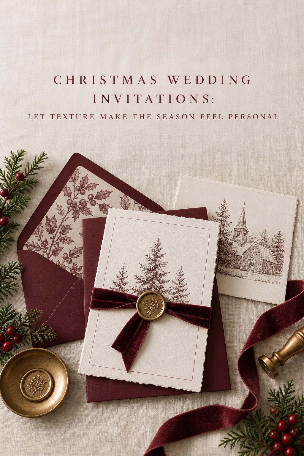
Build the wording and typography hierarchy
A Christmas wedding invitation can be expressive without becoming difficult to read. The hierarchy should answer the guest’s questions in a predictable order: who is inviting me, who is getting married, what is happening, and where and when should I arrive? Decorative type belongs around that structure, not on top of it.
Write for the wedding you are actually hosting
Formal wording typically spells out dates and times and names hosts in a traditional way. Modern wording can be warmer and shorter. Both are valid when the tone matches the event. A black-tie ceremony in a church may call for formal language. A small secular dinner may suit “Together with their families, Alex and Jordan invite you to celebrate.” The important thing is alignment. Casual words on a very formal card can confuse guests, while overly grand language can make a relaxed celebration feel unlike the couple.
Seasonal wording should be inclusive and accurate. If Christmas is central to your ceremony or family tradition, a direct reference may be meaningful. If the date is simply in December, “winter,” “holiday season,” or “joyful gathering” may communicate the mood more honestly. Guests should not have to infer religious expectations from a color palette alone.
Use type families like a capsule wardrobe
Limit the suite to one primary type family and one supporting style. An old-style serif can handle the names and body details, while a small script or sans serif adds contrast for labels. Too many fonts make even expensive paper feel unedited. Size, spacing, weight, and capitalization can create variety without adding another typeface.
Check every line at the size guests will actually read. Thin white type on red stock may disappear in a photograph and become tiring in person. Script names should have enough separation between letters. Dates written as figures need numerals that cannot be mistaken for one another. If your invitation relies on foil, request a proof because fine details can change when the process meets textured paper.
Place dress code and website information where it helps
Dress code information can sit at the bottom of the main invitation, on a details card, or on the wedding website. Choose the location based on how much interpretation guests will need. “Black tie” may be enough on the card. “Festive cocktail attire” may benefit from a short website explanation with examples, especially if the couple wants color and personality without costumes.
Do not make the QR code the visual hero. Give it breathing room, label it clearly, and include a typed URL as a backup. The best designed suite still fails if guests cannot access the travel or RSVP information.
Prioritize paper, finishes, assembly, and timing
Once the capsule and visual direction are clear, spend money where guests will notice it and where the invitation must perform. Paper color changes how every printed ink looks. A warm cream can turn cool gray into a softer taupe, while bright white makes colors look sharper. Ask for physical samples and view them in daylight and indoor light before approving a full order.
Choose finishes that support the concept
Foil is effective when it marks a meaningful detail: the couple’s names, a monogram, a border, or a small botanical. Metallic ink can offer a softer and often more economical shimmer across a larger area. White ink looks crisp on deep red, green, or navy stock. Letterpress adds a tactile impression that can make a minimal design feel luxurious without an abundance of decoration.
Vellum, ribbon, and wax seals add romance, but they also add assembly time, weight, and sometimes postage. A belly band keeps multiple pieces together and can make a simple suite feel complete. Use it only if the guest can open the invitation without frustration. Decorative complexity should never make the practical act of opening mail feel like a puzzle.
Design the envelope as the first frame
The envelope is not packaging after the design. It is the first frame. A colored envelope, botanical liner, hand-addressed calligraphy, or custom stamp can carry the seasonal mood before the guest sees the main card. Coordinate it with the suite, but do not repeat every graphic element. If the invitation is dark and dramatic, a lighter envelope may make the whole set easier to read in the mail.
Check names and addresses carefully. Address the invitation only to the people invited, and use a details card or website for information that does not belong on the envelope. Before mailing, weigh the complete assembled suite at the post office. A wax seal, thick board, or oversized shape can change postage requirements.
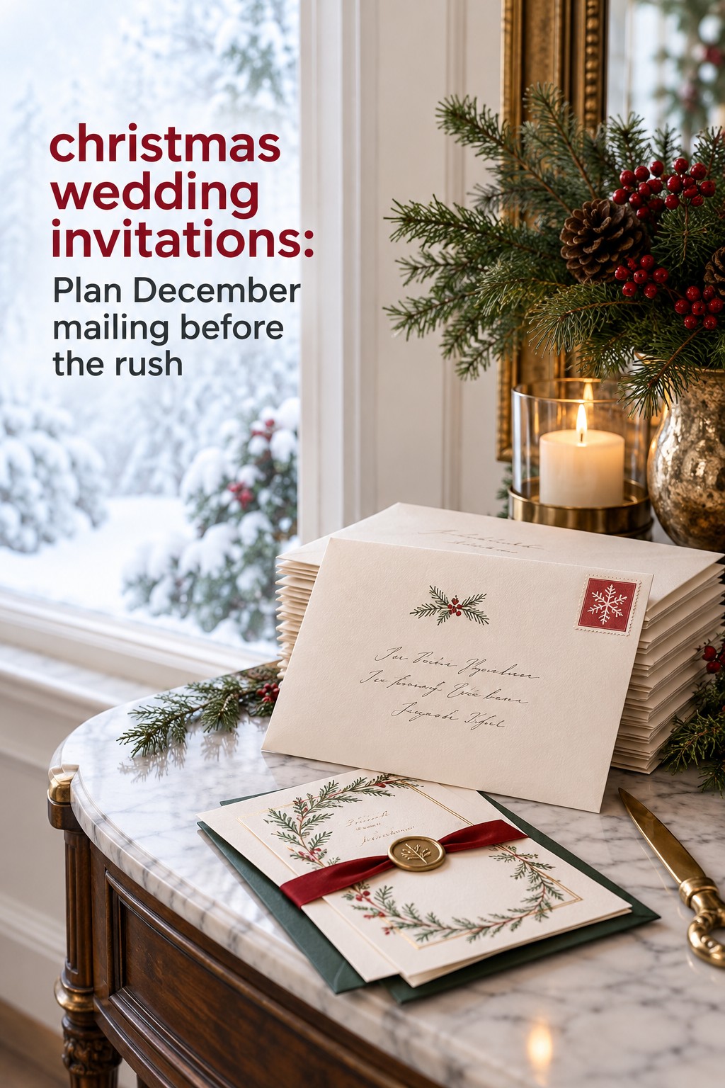
Plan backward from a December date
Holiday timing is part of invitation design. A save-the-date should give guests enough notice to think about travel, family schedules, and lodging. A December wedding may deserve earlier notice than a local event in a quieter month, especially if it falls near Christmas, New Year’s, a school break, or a major travel weekend.
Work backward from the date guests need to respond. Allow time for wording, design, proofing, corrections, printing, assembly, postage testing, and mailing. Build in a buffer for supplier closures and shipping delays. A good production calendar might look like this:
- Early planning: Set the guest list, venue details, wedding website, and visual direction before ordering samples.
- Save-the-date stage: Share the date and general location early enough for holiday travel planning.
- Invitation proof stage: Have at least two people check names, dates, times, addresses, URLs, RSVP deadlines, and meal wording.
- Assembly stage: Sort each component in a consistent order, then check a complete envelope for every household.
- Mailing stage: Confirm postage and keep a small number of spare suites for lost mail or late address changes.
Carry the capsule through the wedding day
A well-built invitation suite gives you a reusable design system. Repeat the core color pair, type hierarchy, paper texture, or motif on programs, menus, place cards, bar signs, and thank-you notes. Repeat does not mean copy. The invitation can carry the strongest version of the color, while day-of stationery uses a calmer background so the table and florals remain visible.
For example, a deep red and antique gold invitation might become cream menus with a small red rule and brass-colored type. An icy blue winter suite might become white ceremony programs with slate text and a silver-gray border. A holiday-neutral ecru suite might carry a small venue crest across the welcome sign, menu, and thank-you card. The result feels intentional because the pieces share a family resemblance without becoming identical.
Before approving the final design, put the capsule through three tests. First, can a guest find the date, time, location, RSVP deadline, and next step in under a minute? Second, does the visual direction still feel right when the cards are viewed together rather than one at a time? Third, can the same design language survive a change in light, paper, and scale? If the answer is yes, your Christmas wedding invitations are doing more than announcing an event. They are opening the door to it.
FAQ
What should Christmas wedding invitations include?
Include the hosts or inviting names, couple’s names, ceremony date and time, ceremony location, reception information, RSVP instructions, and any essential dress code note. Add details, accommodations, directions, or weekend-event cards when guests need that information to attend comfortably.
How early should Christmas wedding invitations be sent?
Plan earlier than you would for a quiet local wedding when the date falls near Christmas, New Year’s, a school break, or a major travel period. Send save-the-dates early enough for guests to plan travel, then allow time for proofing, printing, assembly, postage, and a response deadline that supports your catering and seating plans.
Do Christmas wedding invitations need red and green?
No. Red and green create a classic Christmas look, but emerald and champagne, navy and gold, icy blue and silver, warm ecru and wine, or winter neutrals can feel equally seasonal. Choose a palette that reflects the ceremony and reception rather than forcing a literal holiday scheme.
How can invitations feel festive without looking like Christmas cards?
Use one seasonal signal at a time: a deep color, metallic ink, fine-line evergreen, textured paper, candlelit palette, or elegant script accent. Keep the layout spacious and the typography readable. A restrained detail often feels more personal and lasting than several holiday graphics competing on one card.
What cards belong in a Christmas wedding invitation suite?
The main invitation and a clear RSVP path are the foundation. A details card is useful for the website, dress code, or travel notes. Add reception, accommodations, weekend events, or directions cards only when they solve a specific guest need. The number of pieces should follow the logistics, not a template.
Should Christmas wedding invitations mention the holiday directly?
That depends on your ceremony and audience. If Christmas is part of the religious or cultural meaning of the wedding, direct wording may be appropriate. If the event simply takes place in December, winter or holiday-season language can be more inclusive and accurate. Let the wording match the experience guests will have.
Where should registry and travel information go?
Place the wedding website on a details card or the invitation suite’s designated information area, then keep the registry and full travel guidance on the website. A separate accommodations card can be worthwhile for a destination or holiday-week wedding. Avoid crowding the main invitation with information that only some guests need.
How do I keep a Christmas invitation suite cohesive?
Choose one core palette, one primary type family, one supporting style, and one motif or material detail. Repeat those decisions with restraint across the invitation, envelope, RSVP card, details card, and day-of stationery. Keep the strongest expression on the main invitation, then simplify supporting pieces.