December Wedding Colors: A Practical Palette Playbook
December wedding colors can feel wonderfully easy at first. The month already suggests candlelight, evergreens, rich fabric, winter sky, warm drinks, and a little sparkle. Then the real decisions arrive. Do you want holiday energy or simply a winter atmosphere? Will the ballroom make dark colors glow, or will a daytime room need more lightness? How do you keep flowers, stationery, attire, and tables from looking like separate ideas?
The most useful answer is to choose a palette as a system, not a collection of swatches. A strong December palette has a mood, a lead shade, a few supporting roles, and enough room for texture. This playbook helps you make those decisions before you order invitations, choose wedding-party attire, or fall in love with a centerpiece that does not fit the rest of the day.
Start With the December Feeling You Want
Do not begin with a color name. Begin with the scene you want guests to remember. December holds more than one visual language, and naming yours makes later choices much faster. A candlelit dinner, a crisp snowy afternoon, a formal black-tie evening, and a relaxed lodge gathering can all happen in the same month without sharing a palette.
Your wedding look is only the beginning.
Keep your guest list, vendors, timeline, and every important detail together with Zarellea — so your day feels as considered as your style.
Try writing one short sentence before opening inspiration boards. For example: “We want a candlelit dinner that feels deep, warm, and grown-up,” or “We want a winter morning that feels bright, quiet, and airy.” That sentence is a filter. It tells you whether a brilliant red accent belongs, whether silver feels better than gold, and whether a soft floral color will support the plan or pull it toward another season.
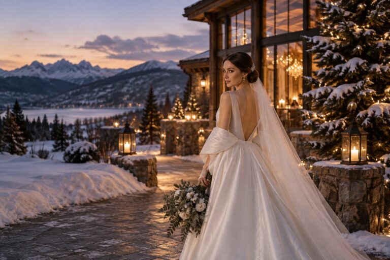
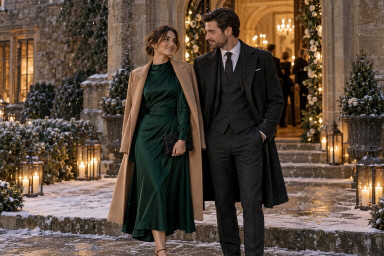
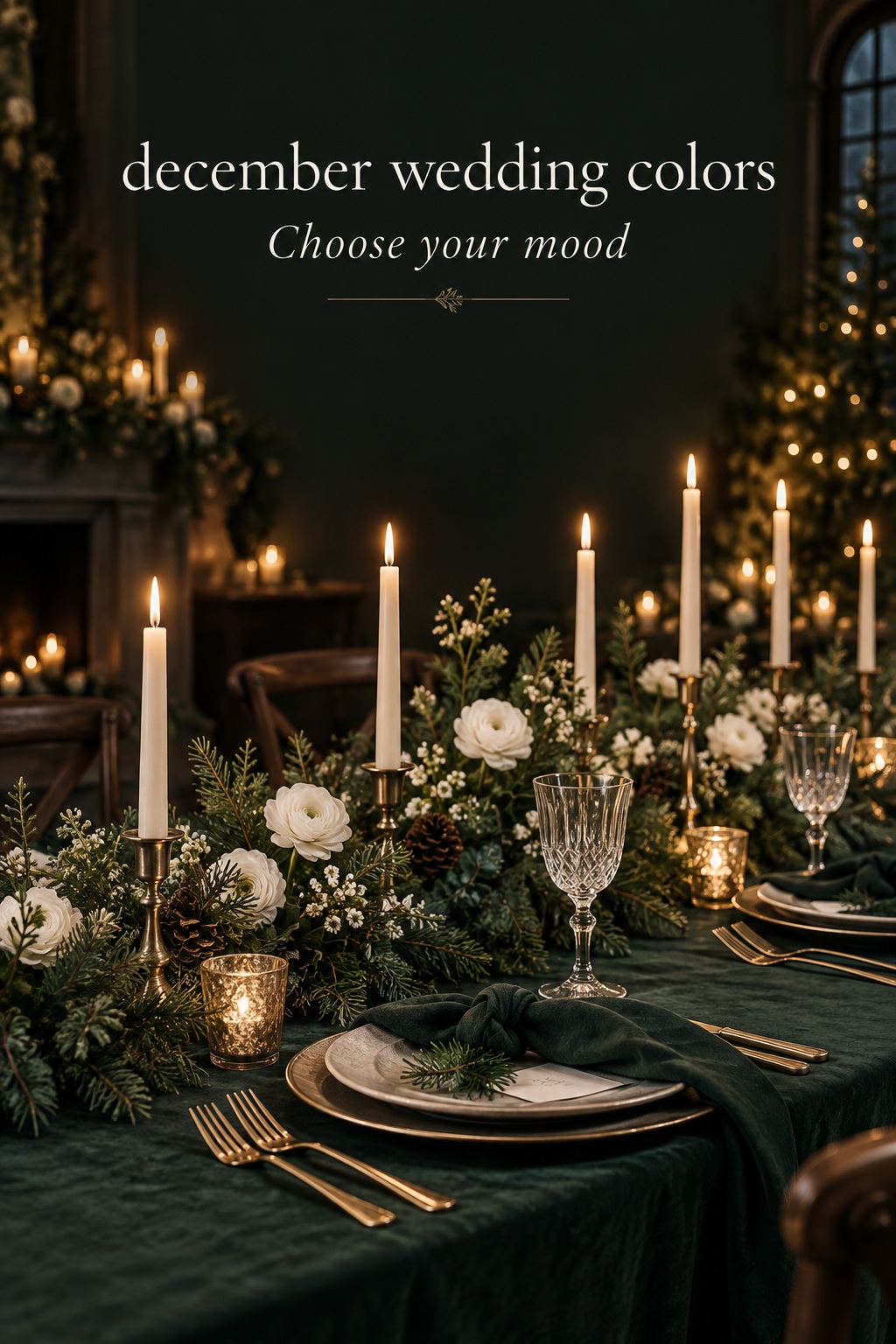
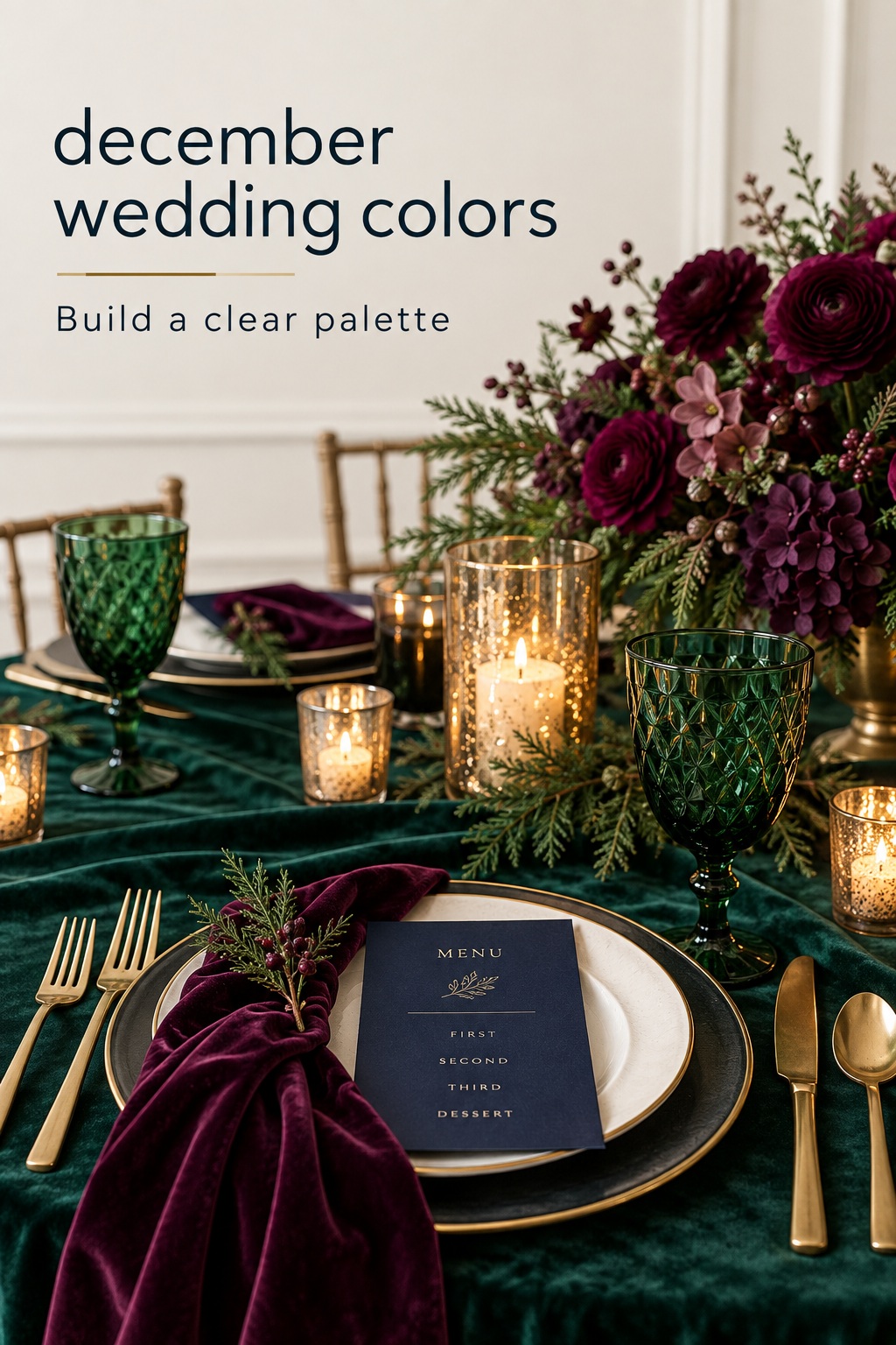
- Refined evergreen: dark green, ivory, antique gold, and warm wood. This direction feels organic, classic, and intimate.
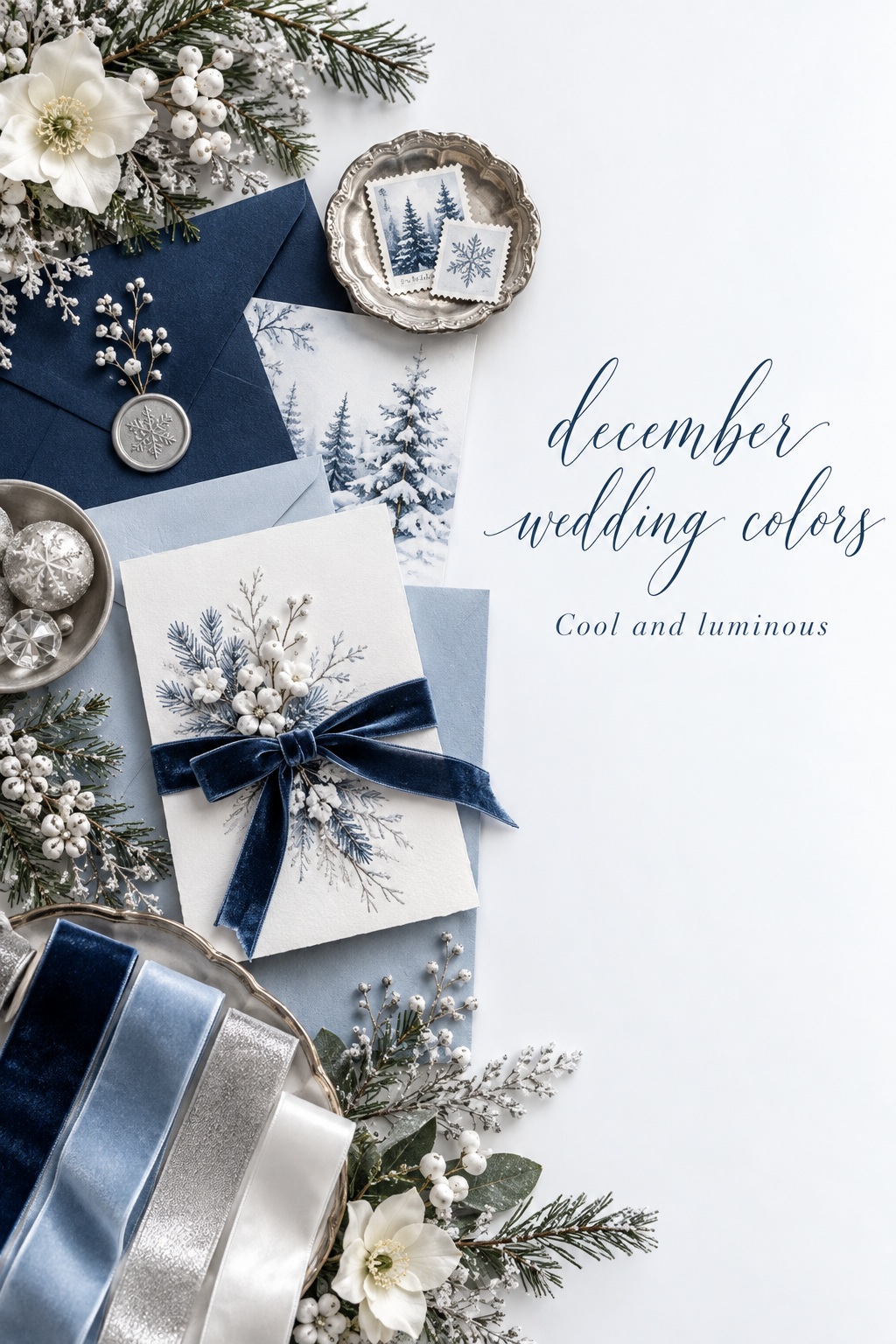
- Cool winter light: midnight blue, pale blue, silver, white, and soft gray. This is clear, luminous, and especially effective in rooms with windows or reflective surfaces.
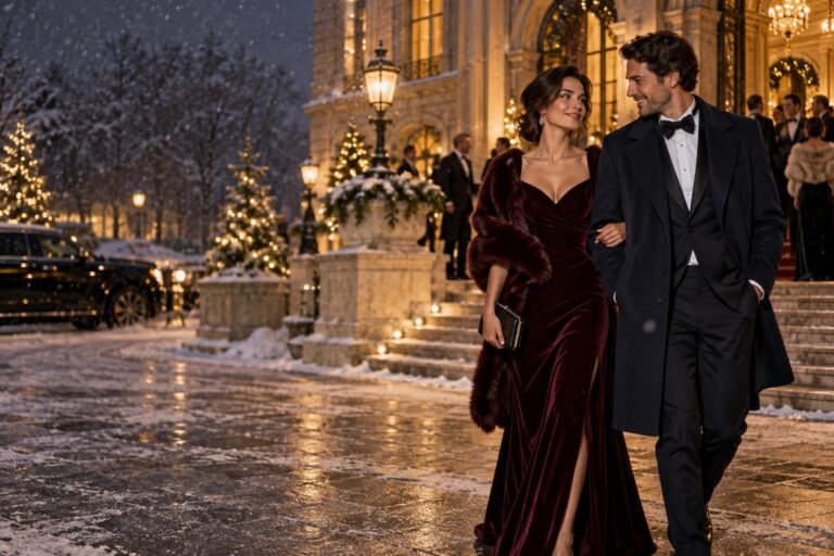
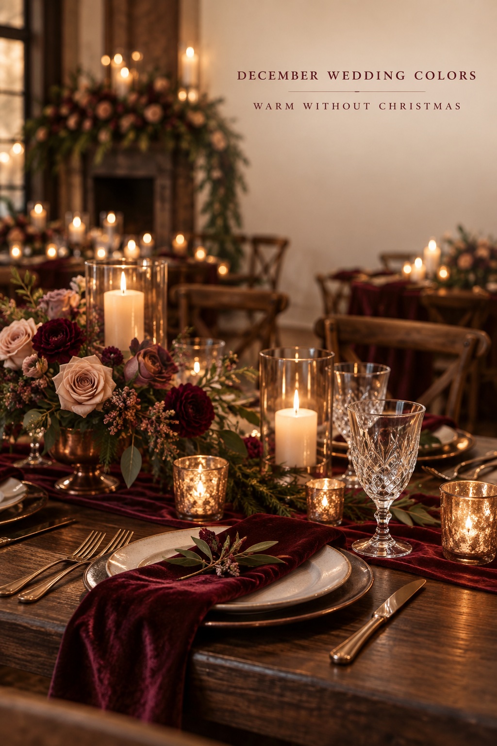
- Warm winter romance: burgundy, berry, blush, copper, and deep brown. This has softness and depth without relying on a literal holiday scheme.
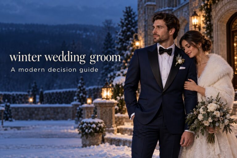
- Formal contrast: black, ivory, champagne, and a restrained metallic finish. This choice is graphic, flexible, and easy to carry through a city or ballroom setting.
There is no obligation to make a December wedding look like Christmas. If you love red and green, use them intentionally and choose nuanced versions such as wine and evergreen. If you do not, use the season through shadow, candlelight, velvet, winter branches, clear glass, or quiet metallic details. Color is only one part of the seasonal story.
Venue matters at this early stage. Dark velvet and candlelight can be beautiful in a restaurant, historic room, or evening reception, but may feel heavy in a bright greenhouse at noon. A pale palette can feel serene in a snowy landscape yet disappear against a cream ballroom. Look at the room at the time your event will take place. Notice wall color, carpet, wood, existing chairs, and the light you cannot remove. Your palette should work with those facts rather than fight them.
Build a Palette That Has Jobs, Not Just Pretty Swatches
A practical palette normally needs three or four jobs. First is the anchor, the shade that makes the strongest impression. Second is a support color that adds depth or contrast. Third is a light or neutral that gives the eye a place to rest. Last is an optional finish, usually a metal, ink, glass tone, or small floral note. When every shade has a job, the final design looks intentional even when the materials vary.
Choose the anchor by asking where you can use it at scale. It might be bridesmaid dresses, napkins, table linens, stationery ink, ceremony drape, or a repeated floral tone. Emerald, navy, burgundy, plum, and black all make convincing anchors because they hold their own in winter light. A pale shade can anchor as well, but it needs contrast around it through foliage, candleholders, ribbon, type, or tableware.
The support color should solve a specific visual problem. Navy can cool an evergreen palette. Burgundy can warm a black-and-ivory scheme. Blush can soften a dark plum room. Charcoal can keep a silver-and-blue direction from looking too delicate. It does not need to appear everywhere. In fact, a support shade is often more elegant when it appears in only two or three places, such as menus, taper candles, or a small floral note.
Your light color does more work than it receives credit for. Ivory, soft gray, mushroom, pale blue, muted blush, and champagne can separate dark pieces and make photographs easier to read. Use it in paper, linens, candles, florals, cake, or place settings. Pure bright white creates a sharper look; ivory makes the same palette warmer. Choose based on the dress, the tableware, and the venue, not only on a digital swatch.
Finally, edit the finish. Gold, brass, champagne, silver, pewter, clear glass, black metal, and warm wood each change the same colors. Gold makes navy and evergreen feel richer. Silver heightens a blue-gray palette. Copper brings berry tones forward. Black metal makes soft colors more modern. Pick one dominant finish and let any second finish be quiet. A room with gold flatware, silver chairs, copper votives, and black frames can easily lose its point of view.
- Pick one anchor shade you can repeat at scale.
- Add one support shade that creates contrast or warmth.
- Choose one light neutral for paper, linens, flowers, or tableware.
- Limit metallic and material finishes to one main direction.
- Save novelty colors for a small, purposeful accent.
Use Four December Wedding Color Directions
Evergreen, ivory, and antique gold
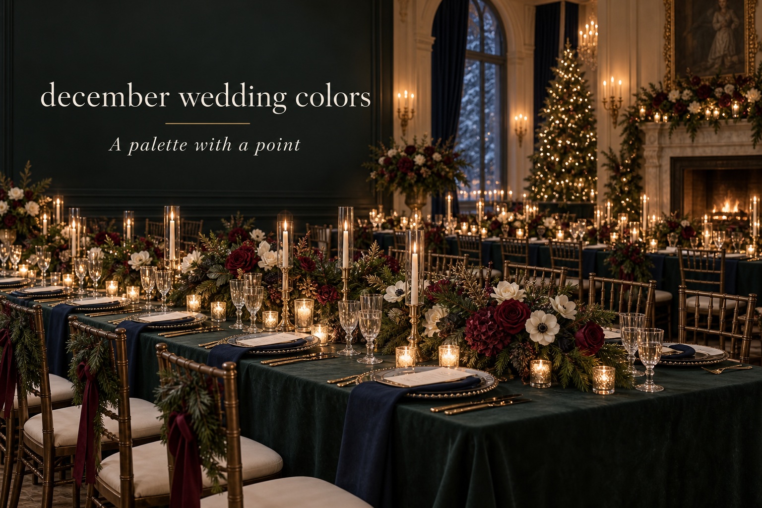
This is a natural starting point for a candlelit December celebration, but it becomes more sophisticated when green is treated as a deep anchor rather than a holiday decoration. Use evergreen or forest green in linens, dresses, ribbon, or ceremony foliage. Let ivory appear in candles, florals, paper, and cake. Antique gold can live in flatware, frames, candleholders, or a slim line on stationery.
Keep the composition varied through texture. Velvet, matte paper, clear glass, dark wood, and soft petals prevent the palette from becoming one dense field of green. If you add red, make it a dark berry or wine note, not a second full-scale color. This palette is especially useful when the venue already includes wood, stone, or warm lighting.
Midnight blue, ice blue, silver, and white
This direction suits a bright winter ceremony, a formal evening, or a room with cool daylight. Midnight blue gives the palette weight. Ice blue can appear in stationery, glass, ribbon, or a delicate floral note. Silver and clear glass bring reflection without asking every object to sparkle. White or soft gray keeps the whole scheme open.
Use different values of blue rather than many unrelated colors. For example, keep dark navy in attire and menus, pale blue in paper and candles, and silver only at the table. If the room is already cool, introduce warmth through candlelight, natural wood, or a small amount of champagne rather than adding a competing metallic story.
Burgundy, blush, copper, and dark wood
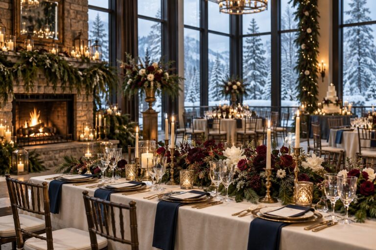
For a December wedding that feels romantic rather than overtly festive, use burgundy as the anchor and let blush act as the lightening shade. Copper, cinnamon, or warm brass can become the finish, while dark wood keeps the palette grounded. This route is generous with flowers, but it still needs editing. Keep the berry family consistent instead of combining every red, pink, and purple you can find.
This palette works beautifully for a restaurant, barn, or heritage venue because it has enough depth to sit beside existing wood and low light. Use blush in a small amount, perhaps in the center of a bouquet, a ribbon, a menu backing, or taper candles. When blush is everywhere, the winter character disappears; when it is used as a highlight, it makes the dark tones feel welcoming.
Black, ivory, champagne, and one colored note
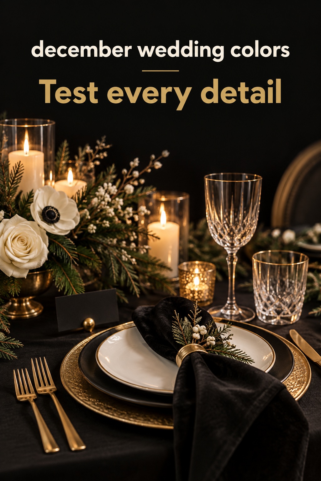
Black and ivory offer a clean foundation for couples who want formal contrast without committing to a full jewel-tone palette. The key is to use champagne or soft gold as a glow, not a third dominant color. Choose one colored note, such as deep green, mauve, dark plum, or smoky blue, and repeat it with restraint in flowers, paper, or linens.
The benefit of this approach is flexibility. A black tuxedo, ivory floral design, champagne glassware, and a dark green menu can look connected without being matched. It also gives your photographer clear visual separation. Be careful not to make every item black. The palette needs pale fabric, candlelight, and negative space to remain celebratory rather than severe.
Run the Palette Through Every Wedding Decision
A palette is only proven when it survives contact with real wedding decisions. Before ordering anything, make one small board that includes the invitation, ceremony view, table, floral sample, wedding-party attire, and a cake or dessert reference. Do not use six perfect photos from six different events. Put your own likely materials beside one another and look for gaps.
Start with stationery because it establishes the first expectation. The invitation does not need to show every color. It should reveal the mood through paper tone, ink, envelope, ribbon, or a subtle painted element. A navy-and-silver event may use ivory paper with navy type and a thin silver edge. A burgundy-and-copper event may use cream paper, berry ink, and a warm neutral envelope. Let the invitation be a preview, not a complete diagram.
For wedding-party attire, choose the color that photographs most confidently against the venue and the couple’s clothing. One rich shade is usually easier than asking each person to find a different color in a wide family. If you want variation, vary texture or depth within a controlled range. Keep bouquets, boutonnieres, and accessories quieter so the outfits do not compete with the ceremony background.
Flowers should bridge the palette instead of literally reproducing it. In an evergreen scheme, white flowers, dark foliage, and a few berry notes can be more memorable than a bouquet forced to include every color. In a blue-and-silver scheme, use white blooms, gray-green foliage, and soft blue details rather than searching for large quantities of one exact blue flower. Discuss the feeling and roles with your florist, then remain open to natural variation.
Tables are where a palette becomes physical. Decide which one element carries the anchor: linen, napkin, charger, menu, or floral runner. Let other pieces support it. If the linen is emerald velvet, use neutral plates and restrained gold. If the plates are black, let the linen stay light. Candles are a practical way to repeat a support color, while menus and place cards can carry a small accent without expensive custom furniture or floral changes.
Lighting is the final translator. Ask for a test or look at photographs from your venue in the same season and time of day. Candlelight warms ivory, gold, burgundy, and wood. Cool overhead light can flatten berry shades and make pale blues look gray. You do not need to change your palette for every bulb, but you should know which shades need contrast and which materials will catch the available light.
Final Palette Review Before You Commit
Use this final review before paying deposits or placing a large order. First, can you name the mood in one sentence? Second, can you identify the anchor, support, light, and finish without adding more categories? Third, do the key choices work in your specific venue? If any answer is vague, remove a color before adding another.
- View all swatches in daylight and in the event’s likely evening light.
- Place a fabric sample beside the invitation paper and a table setting, not just beside another swatch.
- Check whether the couple’s attire remains visually distinct from the wedding party.
- Choose one metallic or material finish to lead the tablescape.
- Make sure there is a light element in each major scene.
- Decide where the accent color will appear and where it will not.
- Remove any detail that reads as a holiday party if that is not your intended mood.
- Keep a short palette note for every vendor so the same language follows the design.
Common problems are usually easy to correct. A palette that feels flat needs texture or a lighter neutral, not three more colors. A room that feels too literal often needs a deeper red, a less saturated green, or fewer themed objects. A dark palette that photographs as one block needs contrast in linens, plates, candles, or paper. A pale palette that disappears needs one confident anchor. Corrections work best when they are made before every decision has been ordered.
Remember that the goal is not color perfection. Guests will not inspect whether the menu ribbon matches every bloom. They will notice a room that feels coherent, welcoming, and specific to you. Choose a small set of colors that can do real work, repeat them with intention, and allow materials, flowers, and candlelight to add the depth.
Sources and Methodology
This playbook was developed from a review of ten opened US search results about winter and December wedding palettes. The design process draws particularly on the palette examples from Minted’s winter wedding colors guide and the venue-and-mood examples in WeddingWire’s winter color palette roundup. The recommendations are editorial planning guidance, not a claim of firsthand testing.
FAQ
What are good December wedding colors?
Good December wedding colors are the ones that match your venue, timing, and desired mood. Evergreen and ivory, midnight blue and silver, burgundy and copper, or black and champagne are all useful starting directions. Give each palette an anchor, a supporting shade, a light neutral, and a finish.
Do December wedding colors have to be red and green?
No. Red and green can work when they suit the couple’s vision, but December also supports blue and silver, plum and gold, berry and blush, black and ivory, or gray and evergreen. Use texture and lighting to make the design feel seasonal without relying on a holiday theme.
How many colors should a December wedding palette have?
Three or four roles are usually enough: one anchor, one support color, one light neutral, and an optional metallic or material finish. Some roles can be expressed through texture rather than a new color. A smaller system is easier for vendors and looks more coherent in photographs.
How can I make a December palette feel festive but not like Christmas?
Use nuanced shades such as evergreen, wine, plum, navy, or antique gold, then add seasonal atmosphere through candles, velvet, branches, glass, and warm light. Avoid novelty motifs unless a holiday celebration is genuinely your goal. A limited palette will read more like a wedding than a themed party.
Should bridesmaid dresses match the main palette color?
They can, especially when one rich anchor shade suits the venue. Choose the color after considering the couple’s attire, ceremony backdrop, and bouquets. If you prefer variation, keep it within a tight depth or texture range so the group still looks intentional.
Which metallic works best with December wedding colors?
Gold and antique brass add warmth to evergreen, burgundy, and black. Silver and pewter support blue, gray, and icy palettes. Copper works well with berry and blush. Choose one main finish and repeat it through tableware, frames, candleholders, or stationery details.
How do I test my palette before ordering decor?
Place real samples together: invitation paper, fabric, a plate, candle, ribbon, and floral reference. Review them in daylight and in comparable evening light. Then test the palette against photos of your venue. This reveals whether you need more contrast, a lighter neutral, or fewer competing finishes.