Wedding Color Ideas That Tell One Cohesive Story
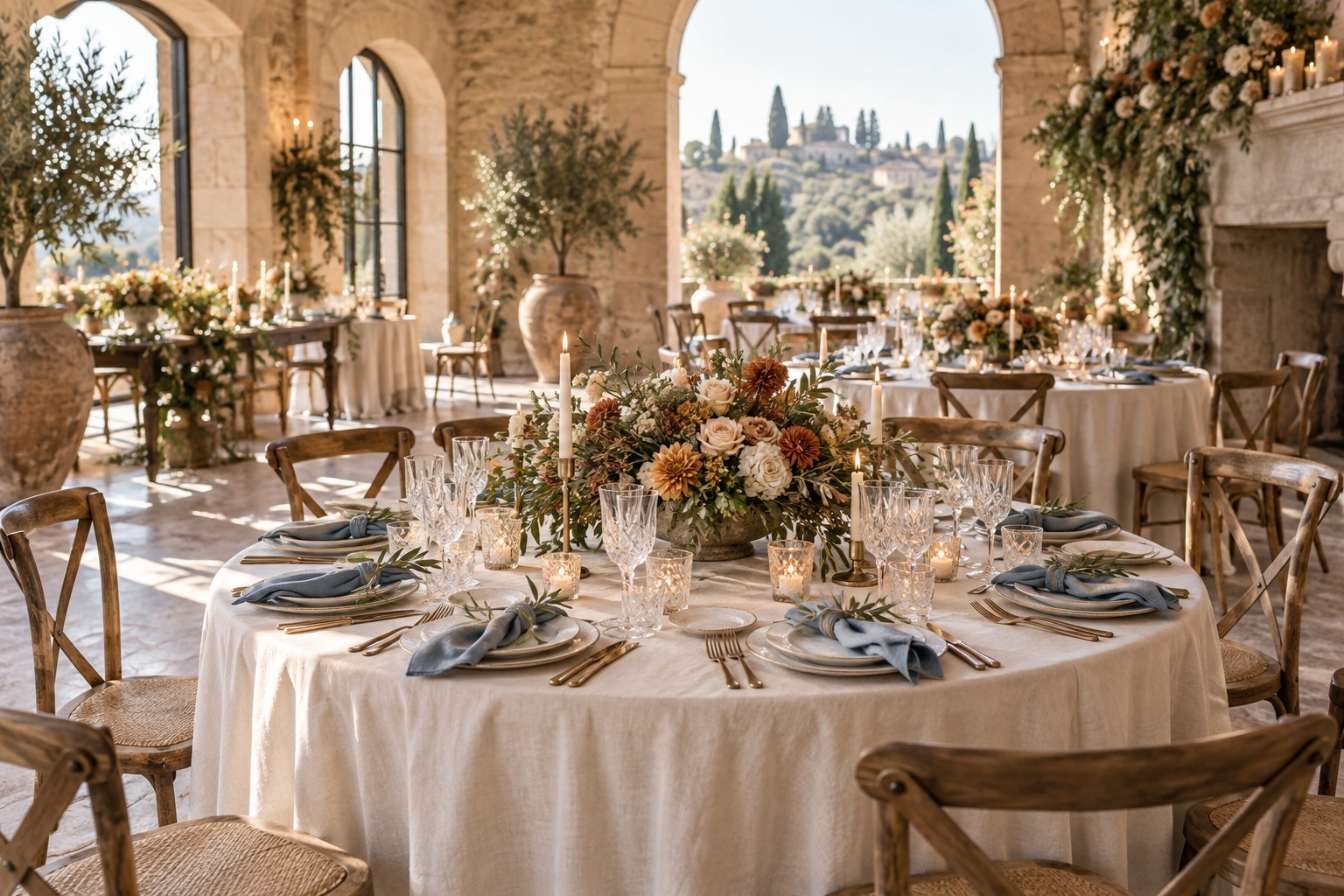
Picture the reception room before anyone arrives. The chairs are already a warm wood. The walls are pale stone, and the windows turn the tablecloths almost blue in late afternoon. On your phone, a vivid pink and orange palette looks irresistible. In the room, it may still be wonderful, but it will tell a different story than it did on the screen. That small shift is where useful wedding color ideas begin.
You do not need a perfect set of matching objects. You need a color direction that makes sense beside the features you cannot move, then a few deliberate ways to carry it through the day. This guide follows four possible stories from the first invitation to the last candlelit table. Each has a different mood and a different reason to choose it. The goal is to help you recognize which one feels like your celebration, then adjust it for the actual place where you will gather.
Walk into your venue as if you were a guest seeing it for the first time. Notice the largest areas before the smallest details: floor, walls, curtains, chairs, landscape through the windows, and the color of the light. These are already part of the wedding design. A palette that responds to them often needs fewer purchased decorations to feel complete. A palette that fights them may ask flowers and fabric to do work they cannot do at a sensible scale.
Take three photographs at the time of day closest to your ceremony and reception. Make one wide view, one table-height view, and one close view of an existing material such as wood, stone, brick, or patterned wallpaper. The point is not to make a polished mood board. It is to see what your proposed colors will sit beside. If the room is richly patterned, a quieter palette may give guests somewhere for the eye to rest. If it is plain and bright, stronger color can create the character the space lacks.
Your wedding look is only the beginning.
Keep your guest list, vendors, timeline, and every important detail together with Zarellea — so your day feels as considered as your style.
Now name the feeling in ordinary language. Perhaps you want the room to feel like an easy garden dinner, a dramatic evening party, a crisp city celebration, or a quiet family meal. Those phrases are more useful than a rigid style label because they lead to decisions. A garden dinner might call for color that appears naturally in flowers and foliage. A city celebration might use sharper contrast in paper, attire, and tableware. The same shade of blue could serve either story, but its partners and materials would change.
One useful question is whether a color belongs to the room, to the people, or to a small detail. Rust can be striking in a bouquet and too much across every table. Navy can feel assured in clothing and paper while disappearing in a dim room if it covers the linens as well. Pale yellow can light up napkins and flowers but may need a darker companion on signs. Assigning each shade a place keeps the idea specific. It also stops a favorite color from becoming an instruction to make everything that color.
You can borrow a cue from a detail you already love. A painting in the venue, a favorite ceramic dish, the view of nearby trees, or a piece of clothing can suggest a relationship between colors. The aim is to translate that relationship, not reproduce the object exactly. A copper roof might lead to warm terracotta ribbon with cream flowers. A blue-gray shoreline might become slate ink, ivory paper, and pale blue fabric. This gives the palette a personal beginning without inventing a theme for the entire event.
Before settling on names such as sage or dusty rose, decide how light or deep the room should feel. A pale green and a forest green belong to one family but create very different scenes. A light palette can still have shape through dark ink, stems, candleholders, or chairs. A deep palette can still breathe through open space and cream table surfaces. Contrast and proportion matter as much as the color names on a sample card.
The venue is guidance, not a command. If you love fuchsia in a neutral stone room, use it confidently where it can make an impression, perhaps in flowers or a few textiles. Let the stone and ivory act as the quiet background. If you love warm terracotta in a cool white gallery, bring a second warm material such as wood or candlelight so the hue does not appear alone. The best adaptation often changes the supporting cast rather than discarding the color you actually want.
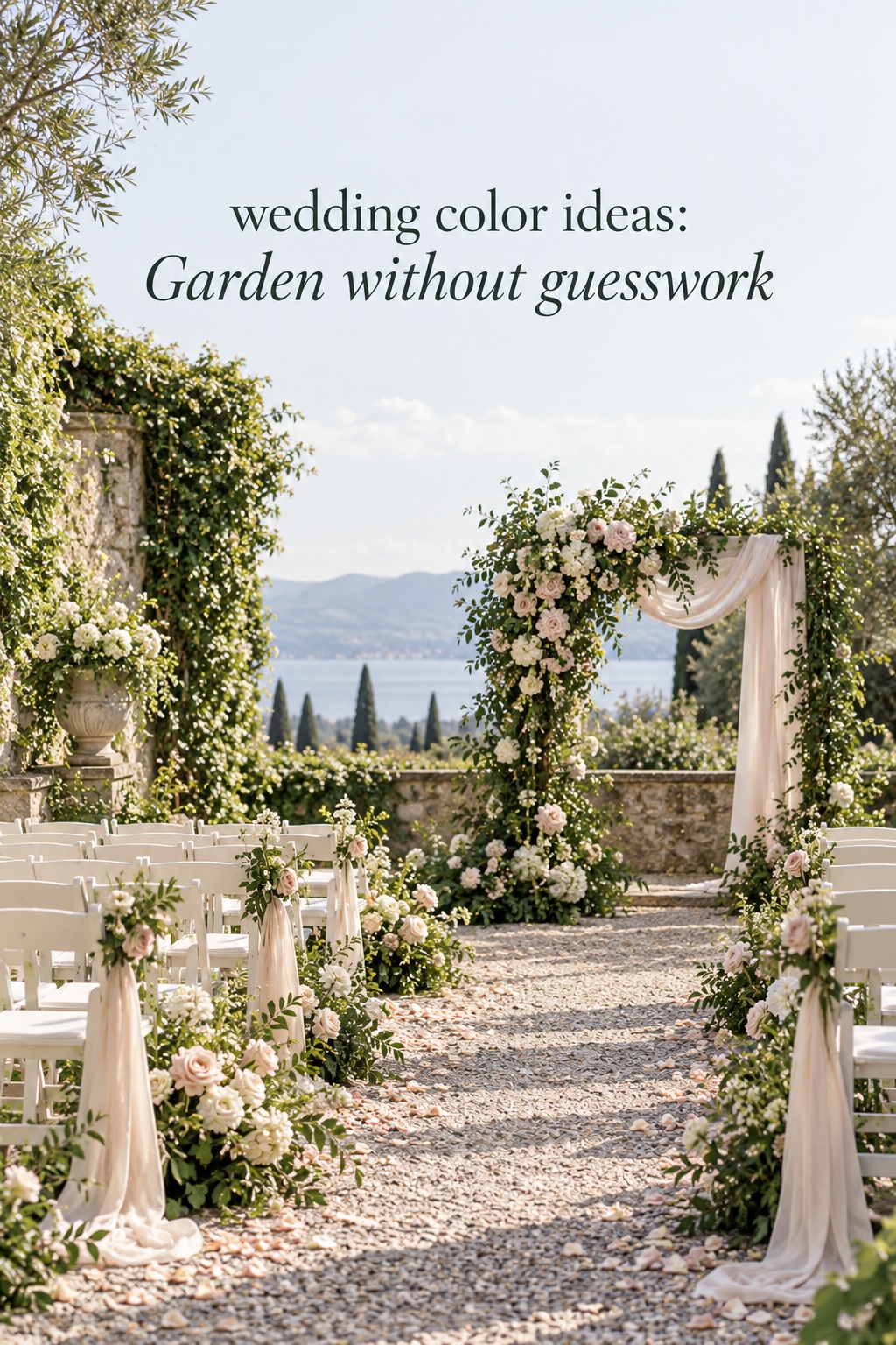
The Garden: Let the Landscape Supply a Color
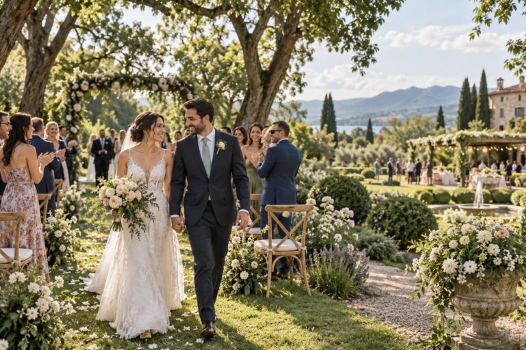
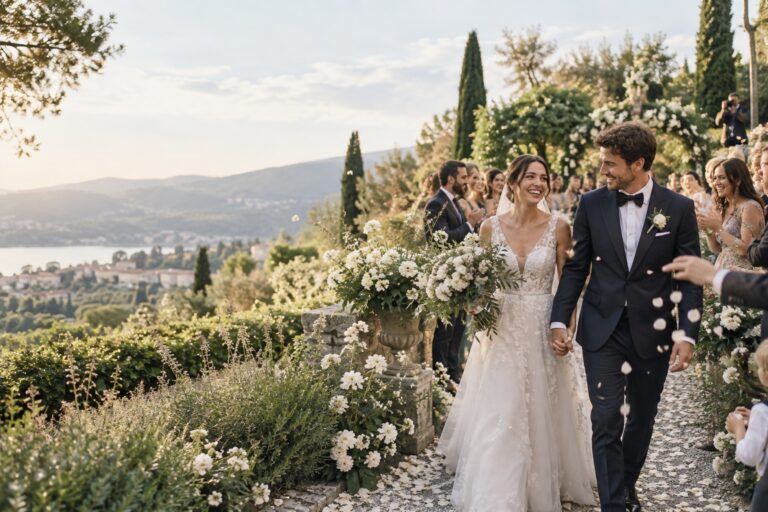
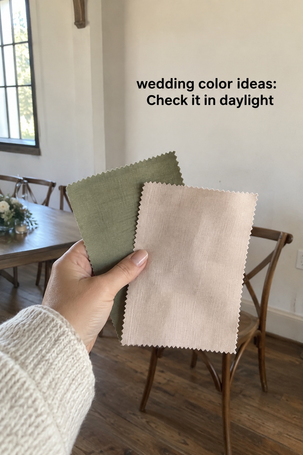
Imagine a ceremony framed by trees and a reception at long tables near an open door. Olive belongs naturally to leaves and stems. Blush appears as a gentle floral note, while cream keeps paper and linens calm. Dark green or charcoal ink gives menus and place cards enough definition. The story feels romantic without asking every surface to become pink.
Put most of the blush in flowers, ribbon, or a few napkins. Let foliage carry the olive, and let existing greenery do some of the work. If the garden is already intensely green, you might use fewer green purchases and make cream more visible at the tables. In a dry or sparse landscape, olive fabric or painted vessels can bring the connection into the room. A muted green bridesmaid dress is an option, but cream and blush bouquets against another dress color could create the same visual link.
This palette is useful when you want softness and a clear sense of place. Its risk is becoming so pale that all the details merge. Keep one dark line somewhere, such as ink, chair color, or a deeper leaf tone. At night, warm candles can add depth without adding another hue. A small amount of texture in paper or linen will make the quiet colors feel intentional.
At the ceremony, work with the frame people will actually see. A garden may already provide green. A stone building may already provide cream. Flowers can introduce your most expressive shade near the aisle or focal point. Look at the distance between guests and the ceremony area. Tiny objects that look persuasive in a close photograph can vanish in a wide view. One clear color gesture at the entrance or ceremony backdrop can do more than many small decorations scattered around the space.
Imagine the garden story moving indoors. During the ceremony, olive is mostly foliage and blush is floral. At dinner, cream linen becomes the main field, olive appears in a napkin or small stem, and blush returns in a few low arrangements. The colors have changed jobs. Guests still feel a continuous design because the same relationships repeat. This is often more graceful than ordering identical objects for every part of the day.
The City Room: Give One Bright Accent a Purpose
Now picture a clean city room with tall windows. Ink blue can live in invitations, a suit, a runner, or a single large table element. Ivory provides breathing room. Clear glass lets the architecture stay visible. A small citrus note, perhaps a vivid orange flower or fruit on a dessert table, makes the palette feel lively rather than severe.
The restraint matters. If orange takes over the linens, candles, flowers, and signage, the room may lose the clarity that made this pairing appealing. Try using it where guests will notice it twice, such as in flowers at the entrance and a few flowers at dinner. Repetition creates a thread. Quantity is not the only way to make a color memorable.
Ink blue is a color with range. In daylight it can read crisp and graphic beside ivory. Under warm evening light it can feel deeper and more formal. Check both versions before ordering large amounts of cloth. If the venue has black details, the blue may need to be clearly lighter or richer to look deliberate. If the room has warm wood, a natural texture can bridge the cool blue and bright citrus.
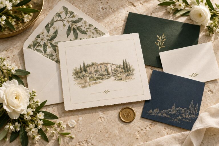
The invitation is the first hint, not a miniature version of the reception. If your palette is olive, blush, cream, and dark ink, cream paper with dark ink and one olive detail may be enough. The blush can wait for the flowers. If you choose ink blue, ivory, and citrus, a blue envelope or type can establish the mood before guests ever see the orange. Leaving something for the wedding day gives the story room to unfold.
Color is also a way to guide attention. Put the strongest contrast where you want guests to look: the ceremony focal point, the seating display, or a long dinner table. Keep service areas and necessary signs clear and legible. If every corner competes for attention, the design loses rhythm. A quiet area can make the expressive one feel more special.
The Evening Reception: Build Depth Without Darkness
For a reception that begins near dusk, imagine a dim room gradually filling with guests. Plum offers depth, smoke blue gives it a cooler neighbor, and champagne catches light in small details. Cream flowers or pale paper can open the composition. This is a color story for atmosphere rather than a rule that every floral stem must be purple.
Keep reflective finishes controlled. Glass and one metal tone may be enough. Too many competing shiny objects can blur the dark colors that give this story its character. Consider using plum in one strong location, such as an entry arrangement or attire, then echo it in smaller details. Smoke blue can appear in paper, ribbon, or a modest textile. Candlelight becomes part of the palette because it changes how the room is experienced, even though it is not a swatch you can buy.
The practical test is visibility. A deep tablecloth, dark chairs, and dark flowers can combine into one large shadow. Place a light menu, plate, flower, or linen against them so guests can read the arrangement. If the venue is already dim, ask to see the space lit for an event before committing to the deepest version of the palette. The same dramatic idea can often be achieved with fewer dark surfaces.
None of these four stories belongs to only one season. A garden palette can work indoors with the right foliage and light. A terracotta palette can feel fresh in spring if its neutral is pale and its materials are light. An evening palette can suit a summer celebration after sunset. Choose by the event you are creating, then let weather and season refine the materials rather than dictate the colors.
An evening transition can be even simpler. Warm lamps or candles deepen colors already in the room. You may need one pale surface or a little reflective glass to keep a dark palette readable. You do not need a second, unrelated color scheme for the reception. Let light, material, and scale do the changing. If a new accent appears after dark, repeat it at least once so it feels like a development of the story rather than an accident.
The Warm Courtyard: Let Materials Carry the Palette
This story feels like dinner in a place with wood, brick, clay, or a sunlit courtyard. Terracotta has presence, but oat gives it a generous neutral ground. Olive connects it to foliage, and soft white prevents every surface from feeling warm and dense. The palette can be relaxed or polished depending on the materials you choose.
For a relaxed version, think matte pottery, cotton napkins, and loose flowers. For a more formal version, keep the same colors but use pressed linen, refined paper, and a limited number of sculptural arrangements. The names on the swatches barely change. The room does because texture and shape communicate as strongly as hue.
Terracotta is especially effective as a partial note. A floral ribbon, a candle, a patterned menu edge, or a few blooms can make the color visible without turning the entire table orange. If your venue already has red brick, let the building supply some of that warmth. Choose an oat or ivory table surface to keep the design legible. If the venue has little warmth of its own, a larger terracotta area may be welcome.
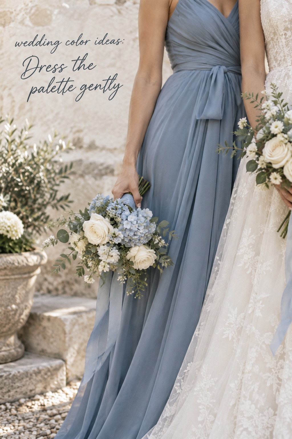
Attire carries color differently from decor because it moves and appears beside faces, bouquets, and the couple’s clothing. Choose dresses and suits as clothing first. Give a palette direction, then look at real fabric and silhouettes. A blue that works on a paper sample may be much shinier in satin, softer in chiffon, or darker in velvet. A tonal bridal party can be cohesive when fabrics share a similar depth, even if their color names differ. Exact matching between a dress and a napkin is rarely the strongest visual goal.
For portraits, think about the backdrop. If your wedding party stands before green trees, olive dresses may blend into them; a lighter bouquet or a contrasting ribbon can create separation. If the room has a dark wall, plum clothing may benefit from cream flowers or a brighter position near a window. These are compositional decisions rather than a demand to change your favorite palette. Ask your photographer which locations will be used, then look at the colors in those settings.
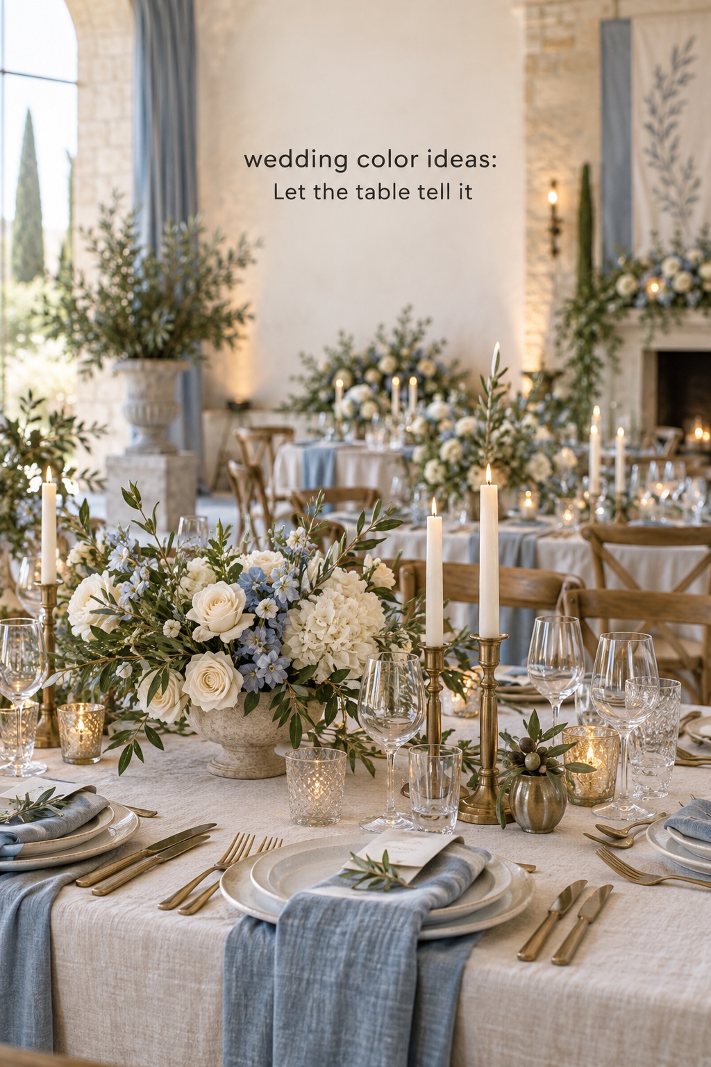
At dinner, the palette can become more tactile. Linens cover a large area, so their shade carries more weight than a small menu. Plates and glass can either add another color or give the eye a rest. Flowers connect the table to the ceremony but need not repeat the ceremony arrangement exactly. A reception may use deeper or warmer versions of the same family as the light changes. The underlying relationship stays recognizable while the mood becomes more intimate.
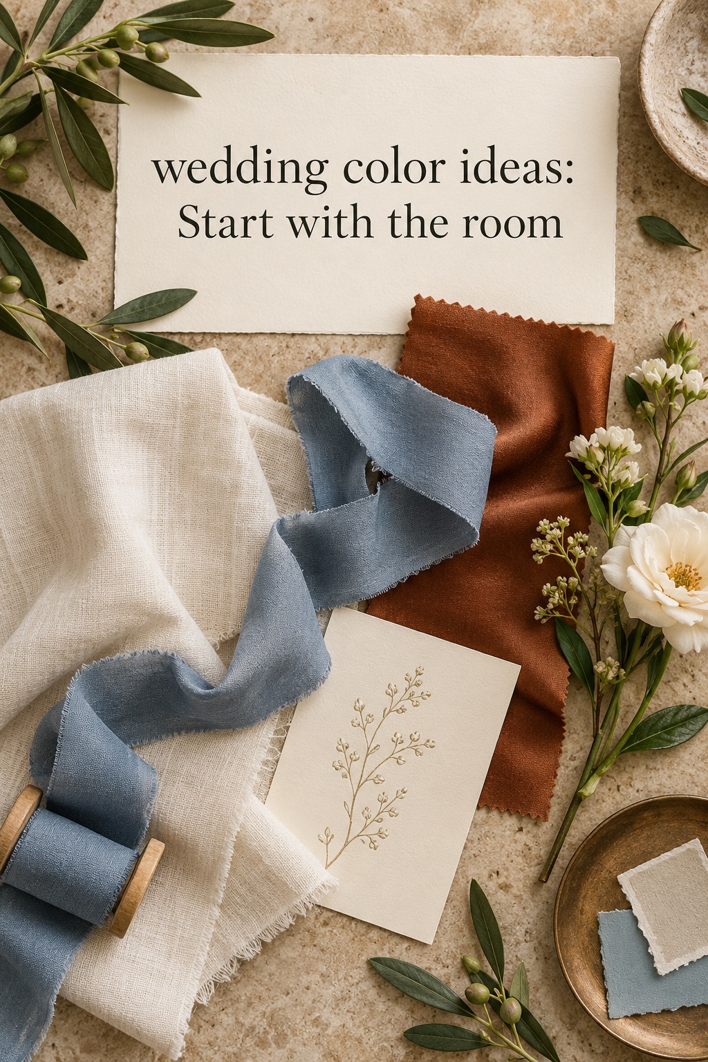
Two digital palettes can look almost identical and behave differently in a room. Before ordering, gather the closest real samples you can: paper, fabric, ribbon, a flower reference, and a photo of the venue. Place them together on a neutral surface. Then move them to daylight and to the kind of artificial light your event will have. The exercise is useful even if every item comes from a different vendor. You are checking relationships, not asking for an impossible laboratory match.
Start with the largest decisions. A linen covers more space than a ribbon, so decide whether its color supports the room. Bridesmaid clothing appears in important photographs, so check the fabric beside the couple’s attire and likely backdrop. Invitations travel to guests long before the event, so ensure the ink is easy to read. A shade that succeeds only when viewed as a tiny online square is a fragile choice for a large purchase.
Ask vendors what variation is normal within their materials. A florist can explain which parts of a proposed floral look rely on a specific bloom and which can be interpreted through a color family. A rental company may have a close linen shade rather than the precise name on your board. A stationer may offer a paper stock whose texture changes the apparent color. Give each vendor the mood, the important shades, and a note about what can vary. That is a more useful brief than a single screenshot without context.
To compare two finalists, set up the same small scene twice. Use one invitation, one fabric, one floral reference, and one venue photo for each. Ask which version feels coherent at a glance and which one requires a long explanation. The stronger choice is often the one that works with what is already there. If both work, choose the one you will enjoy living with through months of decisions, not the one that looks newest for a week.
Edit an overfull palette by removing the least necessary color, not by finding a new neutral to reconcile every disagreement. If blue, green, blush, rust, gold, and black all seem essential, ask what each one is doing. Some may be existing room colors rather than purchases. Others may be only tiny accents. Once those roles are clear, the palette may be easier to communicate than the long list suggests. The goal is clarity for decisions, not a fixed number of swatches.
There is room for surprise. A bouquet may include a natural shade you did not specify. Guests will wear colors outside your palette. The sky may change. A coherent wedding design does not fail when real life enters it. It succeeds when the planned choices create an atmosphere strong enough to hold those variations. Think of the palette as a conversation between the place, the people, and a handful of intentional details.
If you want one final test, explain your choice in a sentence without naming every shade: “We want a bright garden dinner with soft flowers and dark, readable details,” or “We want a warm room with clay notes and generous pale surfaces.” Then look again at your samples. When the sentence and the materials describe the same event, you have moved from collecting wedding color ideas to making one your own.
FAQ
How many colors should a wedding palette have?
There is no required number. Begin with a clear main direction, a quiet supporting tone, and an accent only if it adds something useful. Existing venue materials can act as part of the palette without becoming extra purchases. A short, clear brief is more helpful than a strict count.
Should the wedding colors match the venue?
They should look considered beside its fixed features. Matching the walls or chairs exactly is unnecessary. You can use contrast or a shared undertone, then repeat your chosen colors in visible places. Check samples inside the room if possible, especially when its lighting is unusual.
Do the invitations need to include every wedding color?
No. Let the invitation introduce the mood through paper, ink, envelope, or one accent. Flowers, attire, and tables can reveal the rest later. Too many colors on a small card may weaken the first impression and make the type harder to read.
Can a wedding palette change from ceremony to reception?
Yes. Keep a recognizable relationship between the shades while changing their scale or material. A color used in ceremony flowers might reappear in dinner napkins. Lighting can make the reception feel deeper without requiring an unrelated second palette.
What if my preferred flower does not come in an exact palette shade?
Ask your florist to work within the color family and overall mood. A ribbon, vessel, linen, or nearby bloom can carry the precise note if it matters. Flowers often look more natural when slight variation is welcome rather than corrected.
How do I choose between two wedding color ideas?
Compare both with the same venue photo, fabric, paper, and floral reference. Look at them in the light your event will use. Choose the combination that feels coherent in those real conditions and that you would still enjoy after making many related decisions.