Wedding Invitation Ideas That Feel Like You
The best wedding invitation ideas do more than look beautiful in a saved image. They give guests an accurate first impression of your celebration, make the important details easy to find, and feel unmistakably connected to the two people hosting it. That balance is easier to reach when you decide what the invitation needs to communicate before choosing a font, color, or finishing detail.
Start with the ceremony’s mood and the information guests need, then build a small visual system around both. A garden illustration, a typography-led card, or a bold color field can each feel personal. The right direction is the one you can read at a glance, reproduce across the pieces you actually need, and recognize as yours without adding decoration to every open space.
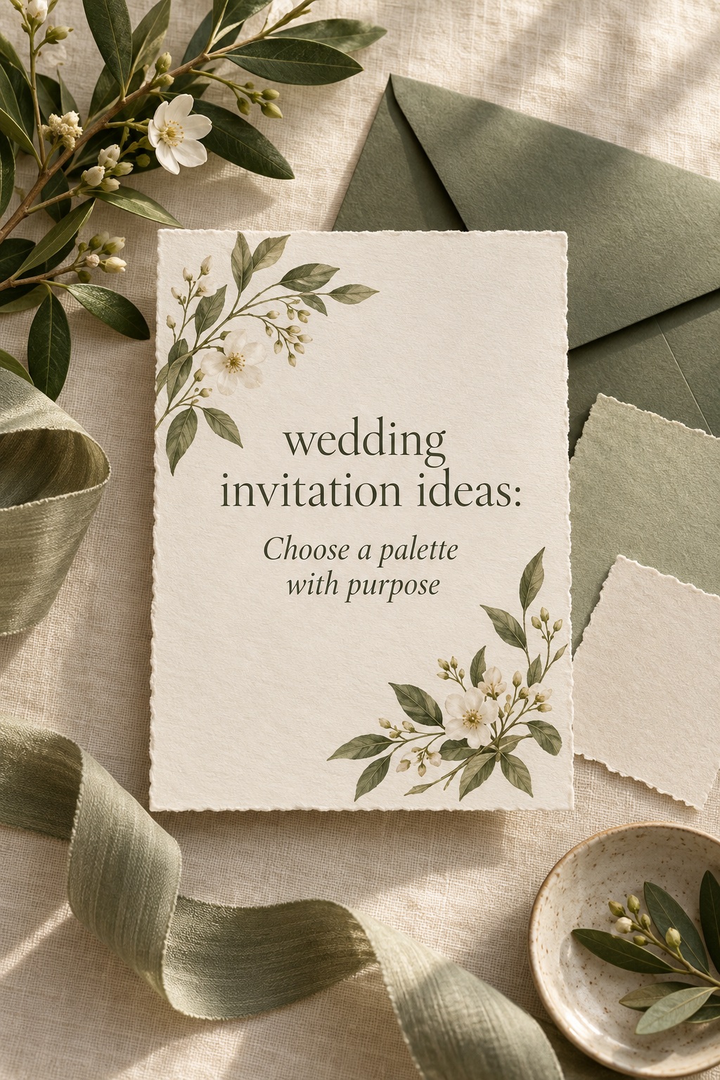
Why a wedding invitation has to do two jobs
An invitation is a welcome and a working document. Its design hints at the formality and atmosphere of the day, while its wording tells a guest where to go, when to arrive, and how to respond. If the visual idea is strong but the date is hard to spot, the design has not finished its job. If every detail is technically present but the card gives no sense of the celebration, it can feel generic before anyone opens the envelope.
Think of the main card as the front door. It should make the hosts, couple, ceremony date, start time, venue, and invitation to attend easy to locate. Depending on the wording and format, it may also carry the RSVP deadline, dress code, or a short reception line. Travel notes, multiple weekend events, meal questions, and full website details often belong on a details card or a clearly labeled website instead of squeezing onto the main face.
Your wedding look is only the beginning.
Keep your guest list, vendors, timeline, and every important detail together with Zarellea — so your day feels as considered as your style.
Before sketching a layout, write down the five questions a guest must be able to answer: Who is inviting me? What am I invited to? When and where is the ceremony? What should I wear? How do I reply? The answers may sit on more than one piece, but guests should not have to decode the design to find them. This simple test keeps visual inspiration connected to an actual use.
Then name the feeling you want the stationery to suggest in three words. “Formal, botanical, and quiet” points toward a different result from “bright, playful, and social.” These words are a filter, not a slogan. When a design choice does not support any of them or help a guest, it is a good candidate to remove.
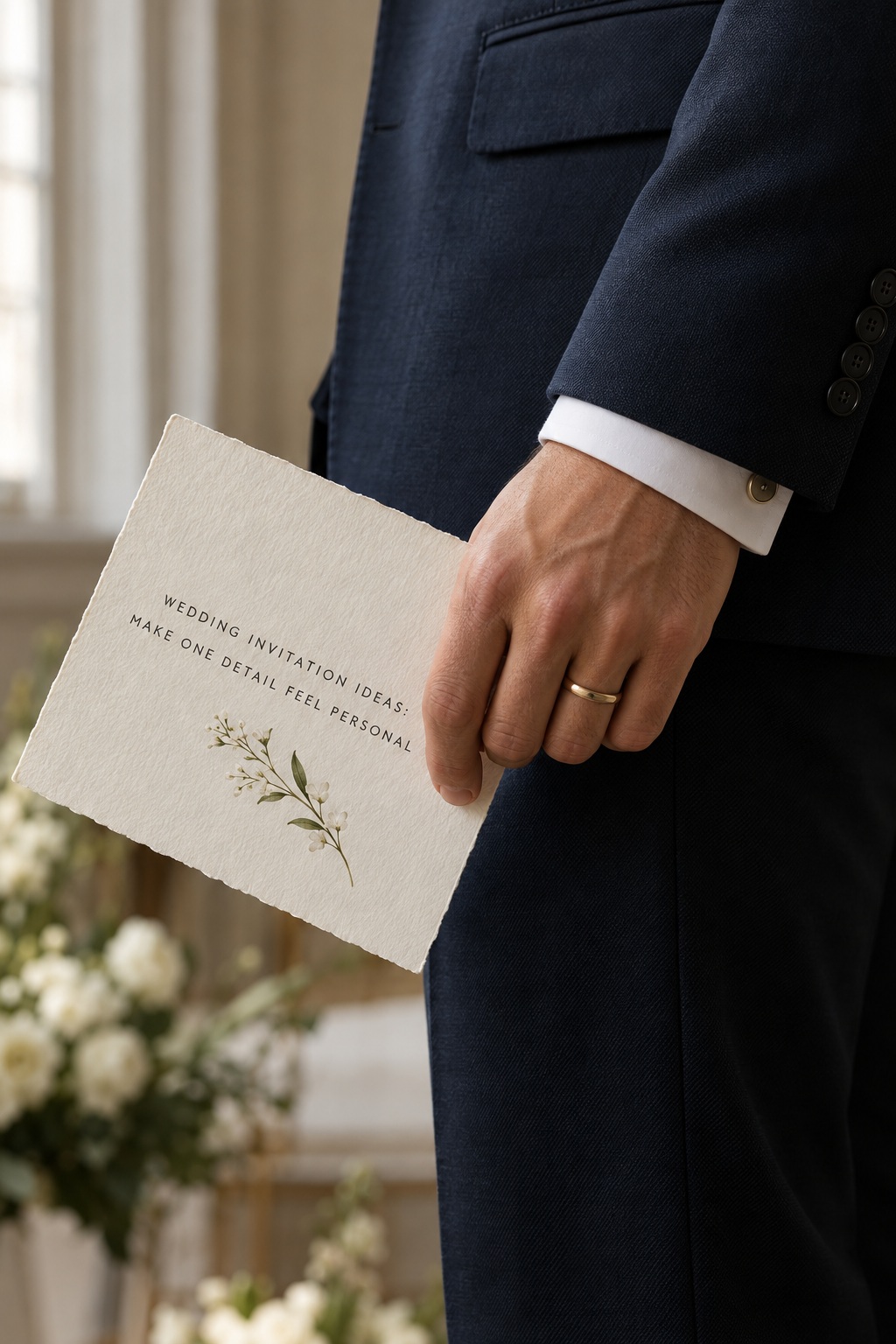
Set the visual rules before browsing designs
Choose the visual rules first so a gallery of attractive templates does not pull the suite in five directions. You do not need a professional brand guide. A short note with a palette, a type pairing, a motif, and a mood is enough to compare options consistently and tell a stationer what matters most.
Choose a palette with a clear lead color
Pick one color that does most of the work, one supporting neutral, and, if you want it, one small accent. The lead color might appear in the names or a border; the neutral can carry the practical text; the accent can mark the RSVP deadline or return address. A mostly ivory card with deep green type and a tiny copper line feels considered because each color has a job. A card with six equally strong colors makes the eye work harder.
Look at the venue, flowers, clothing, and table styling for clues, but do not try to reproduce all of them on paper. An invitation can echo one detail, such as the blue of a tiled ceremony space or the shape of a garden gate. It does not need to show every centerpiece and fabric choice in advance. One reference feels like a preview; a collage of references can become visual noise.
Give every typeface a role
Pair typefaces by function. A display face can make the couple’s names distinctive, while a quieter, highly legible face handles date, time, and address. If you love script, reserve it for a short line rather than setting the venue directions or the full RSVP instructions in it. The more important a line is to getting a guest to the right place, the easier it should be to read at normal size.
Check the smallest text on a printed sample, not only on a bright laptop display. Thin strokes, pale ink, tight tracking, and flourished letterforms can disappear at small sizes or on textured stock. Keep the couple’s names prominent without letting them push the ceremony details into a cramped corner. A hierarchy that works at arm’s length is more useful than a layout that only looks clear when enlarged.
Repeat one motif, not a whole mood board
A motif makes a suite recognizable across the invitation, envelope liner, response card, and any pieces used on the wedding day. It could be a hand-drawn branch, a small architectural outline, a scalloped frame, a monogram, or a simple geometric border. Use it at different scales or crop it on an insert, but keep the underlying drawing or shape consistent.
Also decide where to leave space. The white or open area around names and event details is part of the design. If a motif crosses a text line, reduce it, move it, or use it on the reverse. A quieter layout can feel more distinctive when one personal detail has room to be noticed.
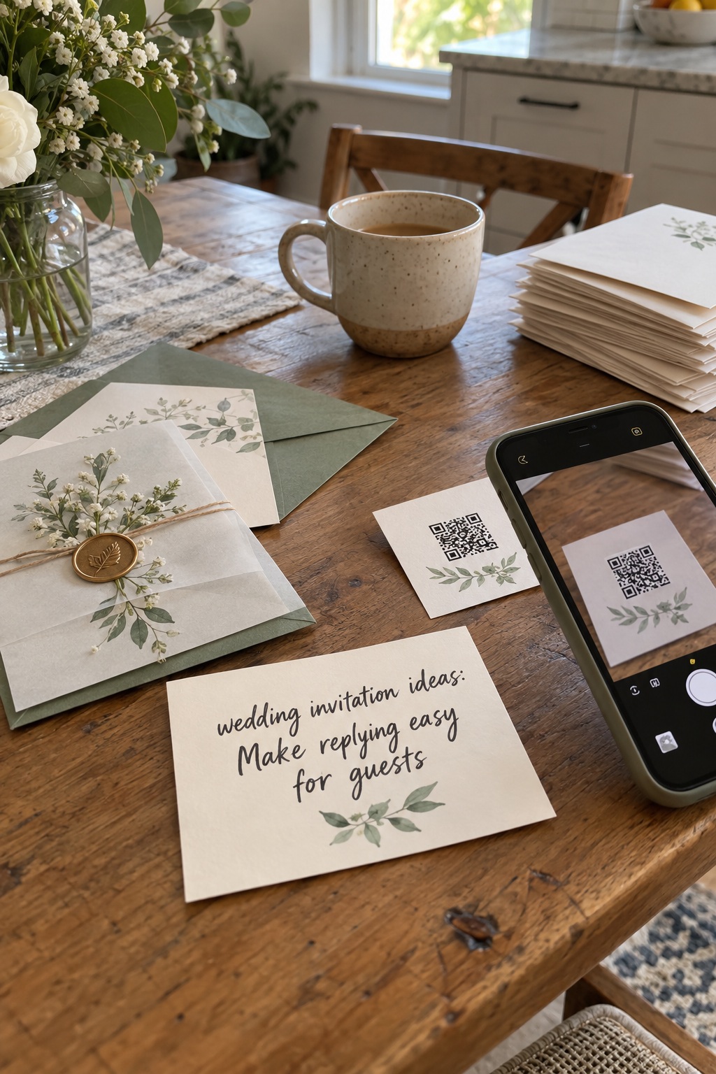
Wedding invitation ideas to adapt to your celebration
Use these as starting recipes rather than rules. Each combines a visual cue with a practical way to keep the main information readable. You can borrow one element from another direction, but choose a clear lead idea so the result feels intentional rather than assembled from unrelated references.
1. Frame a garden ceremony with a fine-line illustration
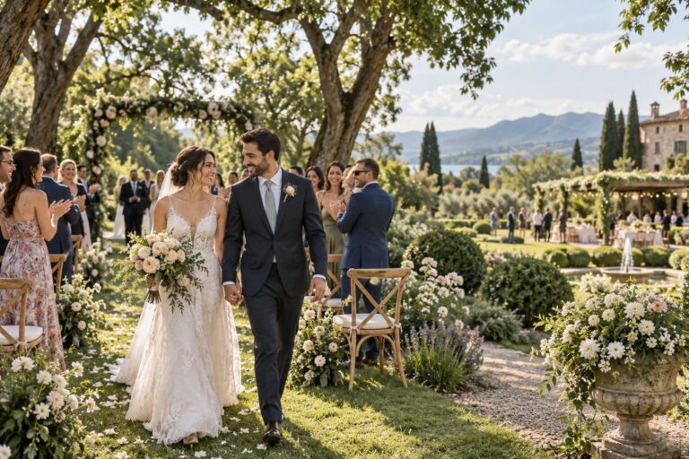
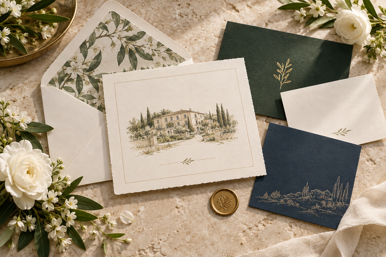
Ask an illustrator to simplify one recognizable feature of the venue: a doorway, a tree-lined path, a greenhouse roof, or the outline of a courtyard. Put the drawing on the upper portion or reverse of the main card, then set the names and details in a calm type pairing below it. A restrained botanical accent can tie the illustration to the flowers without turning the card into a floral catalog.
This idea is strongest when the place is part of the story and the venue has a shape worth remembering. If you are not using a specific location, choose one plant or line motif instead of a generic full bouquet. Ask for a proof that shows both the ink weight and the smallest text. Thin line work can lose definition when it is reduced for print.
2. Let typography carry a formal, editorial invitation
Build the composition from type alone: a serif for the names, balanced spacing around a short invitation line, and a clean face for the ceremony information. Use a centered arrangement for a traditional feel or a left-aligned column for a more contemporary page. A small rule or initial can add a point of focus without competing with the words.
This route works when the wording itself matters and the event has a formal or architectural mood. Keep line breaks deliberate. Do not divide a street name, guest instruction, or long venue name simply to preserve a symmetrical shape. If there is a host line, check that the names remain readable and that the hierarchy still leads the eye from hosts to couple to details.
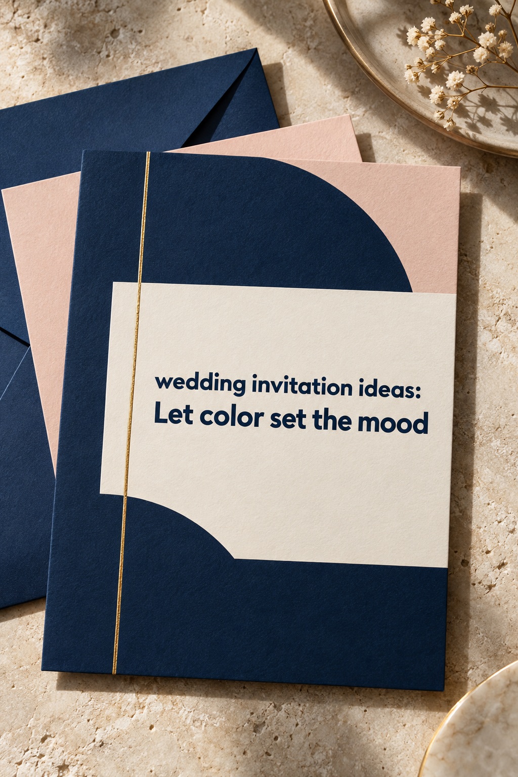
3. Use color blocking for a modern celebration
Choose two neighboring shades or a strong light-dark pair and use them in large, simple shapes. A solid color panel can sit behind the names, or a narrow stripe can distinguish the main card from the RSVP piece. Keep the ceremony details on a quiet area with sufficient contrast. If the palette is already bold, let the envelope or insert remain simpler so the suite has somewhere for the eye to rest.
Color blocking is useful for a city venue, a graphic wedding identity, or couples who want a contemporary card without relying on a photograph. Request a printed proof because screen colors can look different in ink. Check that the darker area does not make small reversed text difficult to read, and avoid putting critical information across a color boundary where the spacing may feel awkward.
4. Make the venue or shared story the illustration
A custom drawing can show the building where you will marry, a meaningful neighborhood corner, a favorite landscape, or a small object connected to your relationship. The idea does not have to tell your entire story. One image, paired with a line of wording that sounds like you, is usually enough to make the invitation feel personal without requiring guests to understand a private joke.
Ask the designer to deliver the illustration in a format that can be scaled for an insert or used later on a menu. Confirm whether the art is full bleed, framed, or meant to sit in open space. Keep the main facts on the same card or on a clearly identified companion card; guests should not have to search the artwork for the address or response instructions.
5. Create a keepsake feel with a monogram and tactile detail
A monogram, crest, or compact custom mark can connect the invitation to menus, place cards, and thank-you stationery. Keep the mark simple enough to reproduce at different sizes. Try it as a small envelope seal or at the top of a details card before giving it equal prominence with the couple’s names. The names still need to be the most obvious answer to who is getting married.
To add a tactile moment, choose one finish that supports the mark: a pressed impression, a foil accent, a deckled edge, or a textured sheet. Treat the finish as a single focal point. If every surface has a seal, ribbon, raised texture, and metallic border, each one competes for attention and can make assembly more complicated. Ask the printer which details affect production, mailing, or the order of assembly before approving the design.
Choose paper and printing by the effect you want
Paper changes how a design feels in the hand and how its colors appear. Smooth stock tends to suit crisp typography and clean graphics. A lightly textured sheet can soften a minimal layout or make a single-color illustration feel more substantial. Heavier stock gives a card a firmer feel, but thickness also affects how the whole suite fits together in its envelope. These are design trade-offs, so compare physical samples of the actual paper and print method instead of choosing from a name alone.
Letterpress creates a pressed impression that adds depth to type or line work. Foil draws attention through a reflective accent. Embossing or debossing emphasizes shape without needing a contrasting ink color. Digital printing can reproduce a wide range of color and imagery with a flat finish. Each method has its own look, so ask the printer to show a comparable sample, explain which fine details reproduce well, and confirm the expected production schedule.
If you are undecided, choose the detail you want guests to notice first. For visible color, prioritize an accurate proof. For a tactile mark, test the impression and paper together. For a photograph or watercolor wash, check that faces and pale areas remain clear. A sample should answer a specific question; it is not just a miniature version of a mood board.
Consider the suite as one assembled object. The main invitation may be the thickest piece, while an RSVP or details card can use a lighter stock. The pieces should fit without bending or forcing the envelope closed. Before finalizing the shape or number of inserts, assemble one complete sample and check how it stacks, slides into the envelope, and reads when opened in order.
Build the suite around the guest, then proof it
Begin with a main invitation and an RSVP route. Add a details card when it carries useful information that would crowd the main card, such as a second location, travel notes, or a weekend schedule. A separate reception card can clarify a venue change. A website or QR code can hold longer directions and updates, but label the link and include a typed URL or another route for guests who do not scan codes.
For an RSVP card, make the response method unmistakable. If guests mail it back, include the return address and check the postage requirement for the finished card. If guests reply online, print a short URL or a legible QR code with a brief instruction. If you ask for a meal selection or attendance at another event, make those choices clear and easy to complete. Avoid asking for information you do not need to organize the day.
Place dress-code guidance where guests can see it while planning an outfit. A short label such as “cocktail attire” may be enough. If the expectation needs explanation, use a details card or website rather than turning the main invitation into a long note. The wording should describe the clothing expectation plainly and match the formality the visual design suggests.
Next, design the envelope as the first frame, not an afterthought. A liner, colored paper, small return-address mark, or hand-addressed names can preview the palette. Keep the recipient names and mailing address easy to read. If you add a wax seal, ribbon, unusual shape, or extra-thick enclosure, ask the postal service or stationer to confirm the assembled piece can be mailed as planned.
Plan the mailing date backward from the celebration and the printer’s lead time. The Knot’s timeline suggests sending invitations around six to eight weeks before the wedding, with more lead time for destination travel; production and reprints need to be factored in earlier. Use the invitation mailing timeline as a planning reference, then confirm dates with your printer and postal service. Set the RSVP date based on when your venue and vendors need the final headcount, rather than choosing it only because it looks tidy on the card.
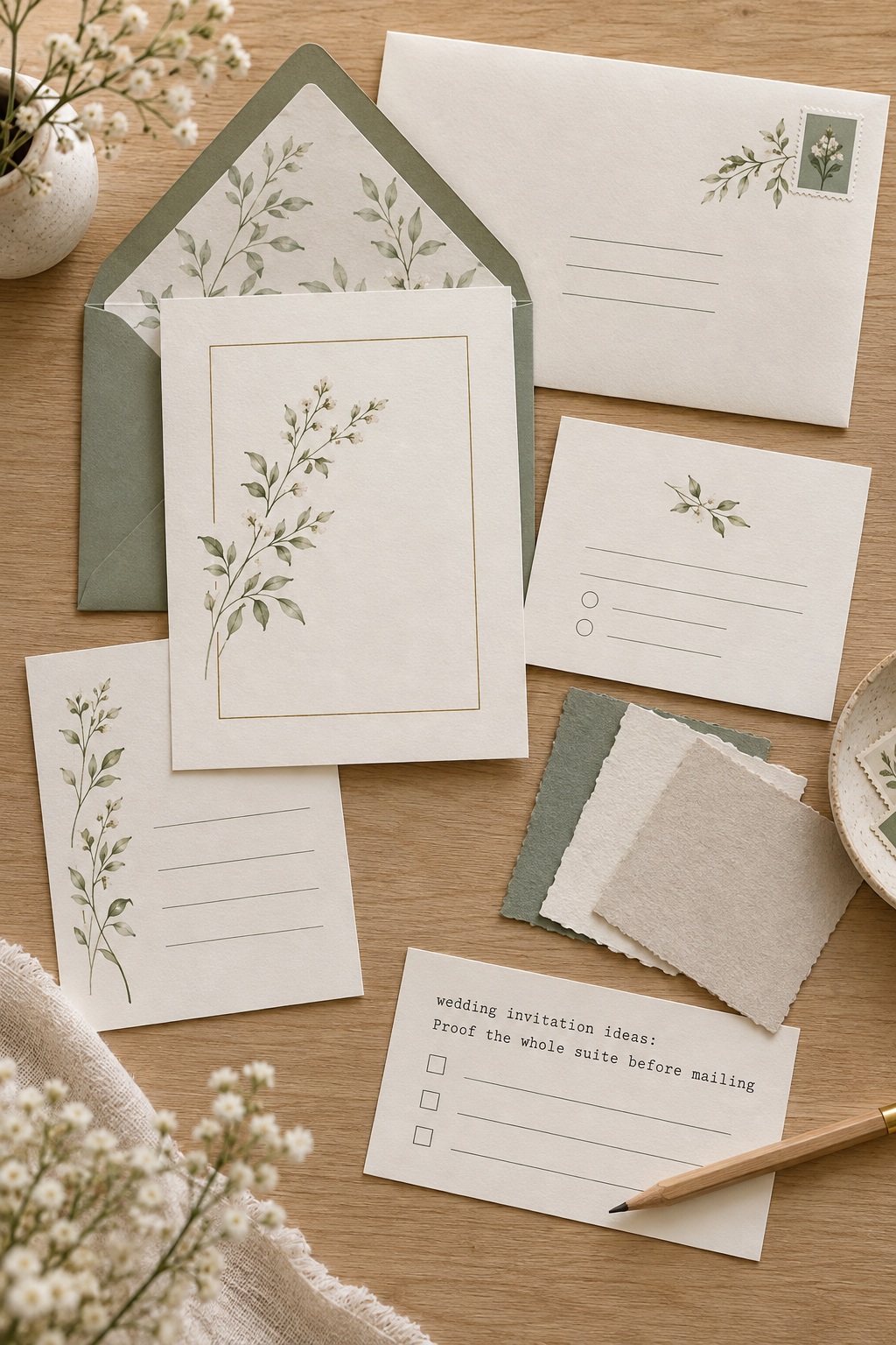
Before approving the order, proof a complete assembled suite. Read names aloud and compare each spelling with the guest list. Check the day, date, year, ceremony start time, venue name, full address, RSVP path, reply deadline, and dress code. Scan any QR code with more than one phone if possible, and type the printed URL into a browser. Review the smallest text at normal reading distance, then ask another person to locate the date and RSVP instructions without coaching.
Ask for a final proof after corrections, even if the change seems minor. Confirm the quantity, paper, envelope color, return address, printing method, and assembly sequence against the order. Keep one approved sample with your planning papers. It can help a stationer match later pieces and can serve as a reference when you create menus or place cards.
Common mistakes that make a good idea harder to use
Choosing the trend before the celebration. A popular motif can be a useful starting point, but it should not dictate the entire card. Ask whether it reflects the venue, the couple, or a specific guest need. If the only reason to choose it is that it appears in a forecast, test another idea before committing.
Trying to show every wedding detail at once. Matching flowers, attire, venue, season, monogram, and color scheme on one card can produce a crowded result. Select one or two connections and let the rest of the event speak for itself. Repetition across a suite is more convincing than an illustration that tries to include the entire day.
Letting decorative type carry critical information. Script can be beautiful for names or a short greeting, but tiny flourishes are hard to scan in an address or deadline. Use a readable face for logistics and check the printed size. The guest should not need to zoom in or rotate the card to understand what to do.
Adding cards without giving them a job. Extra enclosures can increase assembly steps and scatter information. Before adding a card, write the question it answers. If it has no distinct purpose, place the detail on a wedding website or remove it. Keep the main card uncluttered and the overall suite easy to open in sequence.
Approving color and texture only on screen. A digital mockup cannot fully show ink contrast, paper tooth, impression depth, or how several pieces feel together. Order a sample or ask for a printer proof that represents the intended stock and finish. Pay particular attention to small type over color, pale ink on a textured surface, and foil near fine lines.
Leaving logistics until the design is finished. A beautiful card can still be difficult to mail if it is oversized, heavy, unusually shaped, or sealed with a bulky embellishment. Confirm postage and production timing before the final quantity is approved. Allow a buffer for proof revisions and address changes, especially when guests are traveling.
Putting registry information on the invitation. A guest-facing card is a request to celebrate, not a place to ask for a gift. If you maintain a wedding website, place registry details there. Use the invitation or its insert for the date, location, dress expectations, response instructions, and the information guests need to attend.
Sources and methodology
This guide combines current invitation design examples with practical wording, paper, timing, and etiquette guidance. The design ideas are adaptable suggestions, not rules about what every couple should choose. For the information hierarchy and wording, see Zola’s wedding invitation wording guide. For current design signals, The Knot’s 2027 forecast includes personal motifs, hand-drawn illustrations, handwriting, and purposeful supplementary stationery. Treat those as options to consider, not requirements. Recommendations about print finishes are based on the visual effects described by invitation and paper guides; request a physical proof from the printer before approving an order.
FAQ
What should a wedding invitation include?
Include the hosts if you want to name them, the couple’s names, the ceremony date and start time, the venue, and a clear way to respond. Add dress-code guidance or a reception line when guests need it. Put longer travel, weekend, and meal information on an insert or a wedding website so the main card stays readable.
How do I choose a wedding invitation style?
Write down three words for the celebration, then select one lead color, one type pairing, and one motif that support those words. Compare designs against that short brief and against the information guests need. A style is working when it suggests the event clearly and leaves the details easy to scan.
Are printed wedding invitations better than digital ones?
Neither format is automatically right for every celebration. Printed cards create a physical keepsake and work well for guests who prefer mail. Digital invitations can simplify online replies and updates. Consider the formality, guest list, timing, and access needs, and offer a paper option when some guests may not be comfortable with a digital-only process.
When should wedding invitations be mailed?
A common planning window is about six to eight weeks before the wedding, with more time for destination events. Confirm your printer’s production schedule, allow time for proofs and corrections, and set the RSVP deadline around the date your venue needs a final count. Save-the-dates can give guests an earlier heads-up.
What is the difference between letterpress and foil?
Letterpress presses inked design elements into the paper, leaving a tactile impression. Foil adds a reflective accent to selected areas. They create different visual and physical effects, and they can be used separately or in combination depending on the paper and design. Review a printer sample before deciding how either finish will look at the size of your text.
Do I need a separate details card?
Add one when it answers a useful question that would crowd the main invitation, such as how to reach a second venue or where to find travel details. If the information is brief and easy to find on a wedding website, a separate card may not be necessary. Give every enclosure a clear purpose before adding it to the suite.
How can I make a wedding invitation feel personal without overcrowding it?
Choose one detail with a real connection to the couple or venue, such as a small illustration, a monogram, a meaningful color, or a line of original wording. Give it space and keep the rest of the layout simple. Personalization reads more clearly when it has room to stand out.
Should the invitation match the rest of the wedding stationery?
It can share a palette, type style, motif, or paper finish with menus and place cards. It does not need to repeat every element exactly. Reusing one or two visual cues gives the pieces a family resemblance while letting each one remain easy to read for its purpose.